
Episode IV - A new User Interface for the Joomla Backend
On November 17, the first Alpha for Joomla 4 was released. Whilst this release was intended for developers to check their extensions as soon as possible for their compatibility the Joomla 4 User Interface Team has something nice in store for you. In the last few years, we have been planning, discussing and drafting different concepts of the Joomla 4 backend. First of all: the chance to work on the overall backend user interface is a really big honour for us and we say thank you to all those that welcome us to such a great team. It’s a pleasure to work with such passionate people. Our challenge was to design a backend that mostly fits into the given technical structure of Joomla and to change as much as needed, but as little as possible. We want to invite you to take a ride through the draft of the Joomla 4 Backend design.
Article written by Elisa Foltyn, Lukas Jardin and our amazing team
The Style

Typography
The legibility of content is one of the most important parts of a functional and usable graphical user interface. Therefore we decided to use one of the most popular web fonts ‘Roboto’ as the new base font for the backend-template. Including Thin, Light, Regular, Medium, Bold and Black weights with matching oblique styles, it offers a lot of flexibility and underlines the clean and modern approach to the new Backend-Template.
Colours
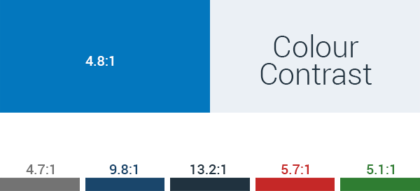
All colours throughout the new backend-design are chosen with accessibility in mind. Regarding the WCAG 2.0 guidelines, it is necessary that the contrast ratio between the foreground colour and the background colour of texts has to be at least 4.5:1 or even higher.
Therefore we decided to work with a dark blue for the sidebar and a light grey as a base for the whole user interface because it results in a flexible base for the further choice of colours.
Moreover, we decided to go for a lightweight and clean approach for the general appearance of the new backend-template. On the one hand and as already mentioned it works well as a base to fit the WCAG 2.0 requirements and on the other hand it gives us the chance to create an interface which is less tiring for the user, as for example a dark template using negative texts may be.
The new Joomla Pattern
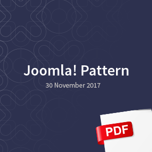 With releasing this backend template draft we are celebrating the premiere of the brand new Joomla pattern with an amazing design by Chiara Aliotta. A lot of you know Chiara as part of the community. She is an award-winning artist and we are lucky to have this new Joomla pattern created by her.
The new pattern represents our community as a network where no one is alone.
Let the presentation, prepared by Chiara speak for itself and click on the image to see the pdf.
We couldn’t be more excited about it.
The pattern was included on the login page and also slightly on the background in the backend.
It’s a source of emotion on this technical subject.
We love it.
The Login Page
The pattern we just mentioned first appears in the backend login screen.

The login screen has by default the new Joomla pattern.
If you want to customize the Login Screen, you can upload an additional image background in the Joomla template manager.
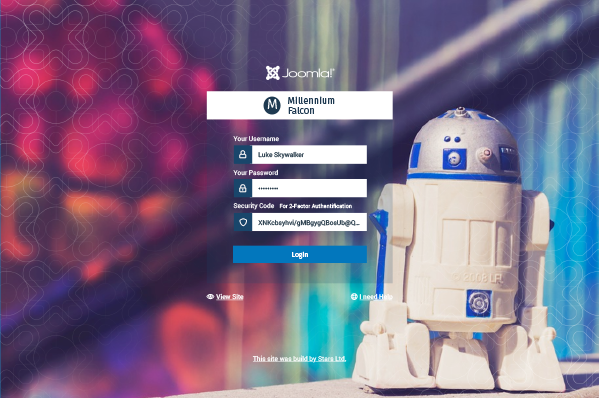
Include your Brand
Another focus we added to the login page is to give you the possibility to upload the logo of the Joomla site. That increases the identification with the backend and also improves the work for Site Integrators who switch between many Joomla installations. If no logo is uploaded the Sitename is shown in the white banner above the login form.
Additionally, as an integrator or administrator, you can set a link to your own business at the bottom of the login page. So anyone with login issues can find and contact you quickly.
As we talk about login issues - a huge percentage of the emails that reach our volunteer Joomla teams are asking for help to recover their administrator password. Therefore we added a help link on the login page to lead you directly to helpful resources.
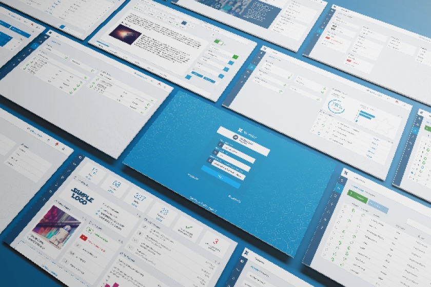
Improve daily work for everyone
Over many long nights, we discussed how to improve the Interface of Joomla without changing too much on the structure. The daily work with Joomla as a Content Management System is to manage content. We set up our articles, modules or components and link or assign them to menu items. Later, we manage the Users and set up the system.
Restructured Backend
 To improve the workflow, we reduced the number of main level items to a minimum. We think fewer choices cause less confusion. Now, your main tasks in the menu sidebar are: User, Menus, Content, Components, Settings and Help. For those that are not comfortable working with only Symbols, you can toggle the menu and show the names of each menu item.
The top bar will identify the page you are currently browsing on on the upper left side. You will be also able to replace the upper Joomla Brandmark with your own Logo.
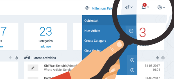 On the right-hand side (ltr version) you find a link to the frontend. Next to it, there is a configurable quickstart icon, where you can put in your most needed links and actions, such as “Create a New Article”, “Manage Categories” or also 3rd party extension actions and links. The notification icon will let you know about important notifications. And in the user icon drop-down, you will find your user settings, where you can change your Details, Language and additional Accessibility Options for Joomla.
Accessible Joomla
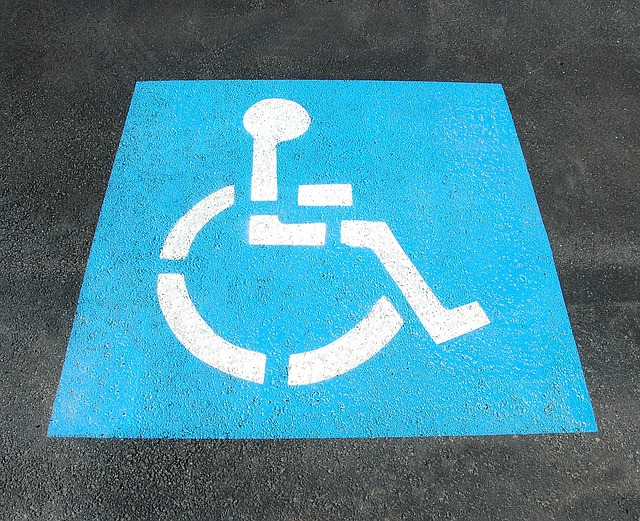
Accessibility? Joomla 4 will be AA compliant. Besides that, you can also customize the colours of your template and your login screen in the admin template settings to fit Joomla into your site's brand.
New Menu logic
Every main level item has a submenu and its own landing page. That means in detail, that if you hover over the first level item, you can access all areas from the submenu. You can also directly click on the main item, and you have a nice overview of the options for that specific area.
This approach has at least three significant advantages:
- Users with accessibility issues can access the submenu items in this way easier with, for example, a mouth stick or if there are special motoric needs this is easier to handle.
- This landing page is also perfect for mobile and tablet. The overview makes navigation just easier.
- You can add your very specific section-related Administrator modules in here. See User statistics, Article Ratings and more.
Reduced Menu Items
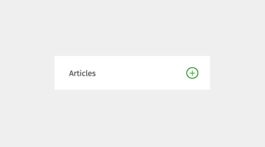
Usually, tasks in Joomla involve managing items or adding items. We divided the number of menu items by adding a plus symbol next to each menu item that directs you to add just these. Click on the plus and create something new. It will make your life much easier when using Joomla day in, day out.
The Dashboard
We love the Dashboard, which is the cockpit of our Joomla! Website. The Dashboard is under your full control and shows by default all the important stuff you need. Customize it by adding your own modules and drag and drop the modules to your favourite place.
Users
There it is - it's mostly the structure you already know from Joomla 3 - here you can manage your Users, the User Custom Fields, User Notes and create new Messages. Since the User Access Settings are more a general setup you find them now in the System Settings Menu Item.
Manage Menus
Again, there is no need to get used to a new structure here. You have a nice overview of all used Menus on the Menu Landing page. And in case of > 10 site menus, you will enjoy a nice overview on the landing page and don't have to scroll through a long menu as in Joomla 3. Since Joomla 3.6, you can set up also custom admin menus. Did you not know that? That's why we make it more visible here.
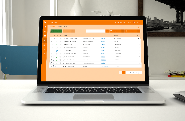
Content
Here you find all the articles that can be displayed on your website. Next, to the known com_content Component and the Custom Fields for com_content, you find here the Media Manager and NEW also the Modules as they are mainly are mainly "content-deliverers".
Manage Articles
Fewer Buttons
We decided to pull out the space vacuum cleaner and tidy up all the different buttons on the Article Manage page. Why would you need to see the trash icon if nothing is selected? All Buttons and options appear contextually. So if you select a published article you will not need the publish button, If you select an unfeatured Item you will not need an unfeatured option. After selecting an item, the action button will become active and give you the relevant possibilities to chose from.
Customize Columns
Manage the Columns for your own needs and save it for your user account. No need to see the languages if you don't run a multilanguage site, no need to bother about the author if it's only you running the backend.
Edit your Articles
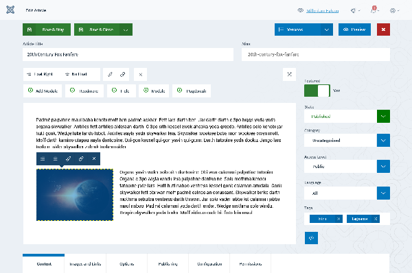
Since the 3rd Level Sidebar is gone you gain a lot of space to edit your articles. Save time by accessing some common options directly inline.Take advantage of the contextual change of the editor: if you select an image, TinyMCE shows you all the Image Options in the Toolbar, and if you select a link you have the link options right on the screen. Context is king.
We added the content tabs on the bottom of the page in a fixed footer. Be always aware of where you are and access it easily with mobile devices.
System Settings
As mentioned before, we moved all the system settings on their own page and grouped them by tasks. Do you want to install something? Find your way in the install panel on the system settings screen. Get some important information directly on the settings page without the need to check in.
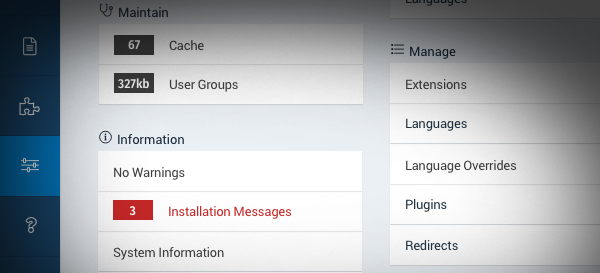
Help
To discover more about Joomla and getting help if needed, the Help tab will bring you to the right place. As a system maintainer, you might want to add here another panel with your site specific documentation.
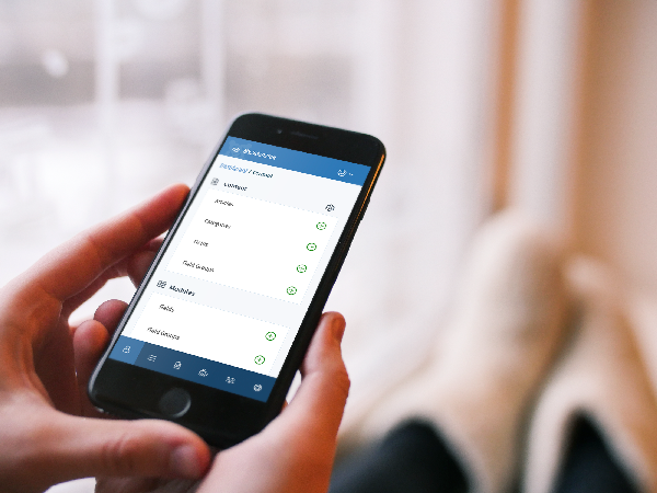
Mobile View
The new look is excellent on mobile. Have a look at this Mockup that shows how the interface will look on a Smartphone.
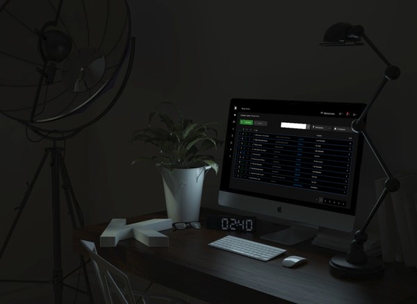
Vibrant and Lightweight
Working with Joomla every day should be a nice and easygoing experience. Today, we introduced a concept for a new fresh look. The new Joomla Template is lightweight and with a vibrant blue. The new Joomla template will be accessible and modern.
If, however, we did not provide your favourite colours, you can easily change the theme to orange or for those from the dark side even to a dark scheme.
"The Force will be with you, always."
Ben Obi-Wan Kenobi
Prototype just landed
We created a prototype to give you a live experience of the concept.
Start at this link and try it.
Base Mission: Begin, try to delete the User Luke, enable and disable Han Solo, delete the Menu Item Officehours,
and Edit the first Article in the Article Manager List. Explore the Hotspots in the prototype by pressing the [Shift] Key.
We look forward to receiving your appreciated Feedback about the look and feel, before we start implementing it in Joomla 4.
Special thanks to Armen Mnatsian, Ciaran Walsh, Charlie Lodder, Elisa Valle, Noemi Sanchez del Rio, Shirat Goldstein, Andy Gaskell, Christiane Maier Stadtherr, Hans Van de Meer, Eddy Prosperi, Esteban Turcious, Joris Stolker, Kawshar Ahmed, Robert Mittl, Shir Ekerling, Dimitris Grammatikogianis, Brian Teeman, George Wilson, Chiara Aliotta, To the whole accessibility team, the ux team and everyone involved in giving constructive, helpful feedback and positive vibes.
Some articles published on the Joomla Community Magazine represent the personal opinion or experience of the Author on the specific topic and might not be aligned to the official position of the Joomla Project
About the author
By accepting you will be accessing a service provided by a third-party external to https://magazine.joomla.org/
Comments