Joomla 5 is coming, time for a new look for all our sites? Join the challenge and have a say.
Wouldn't it be great if Joomla had a coherent look and feel to its real estate, all those sites that are under the Joomla banner, as well as feeding into the Joomla template that people use?
Well now is your chance to have your say in how they will all come together!
Joomla is an organic, dynamic, evolving community-led project which has a lot of history and backstories.
The upshot of such a vibrant and rich development is a legacy of good ideas that never quite made their full potential and others that had perhaps passed their sell-by date.
With Joomla 5 less than 6 months away this is a great time to grasp that jungle of growth and prune back to what is needed and shine a light on the important aspects of the Joomla project.
So let us take a look at the main areas
- https://www.Joomla.org/
- https://developer.Joomla.org
- https://community.Joomla.org
- https://www.opensourcematters.org/
- https://www.Joomla.org/4 - the current landing page
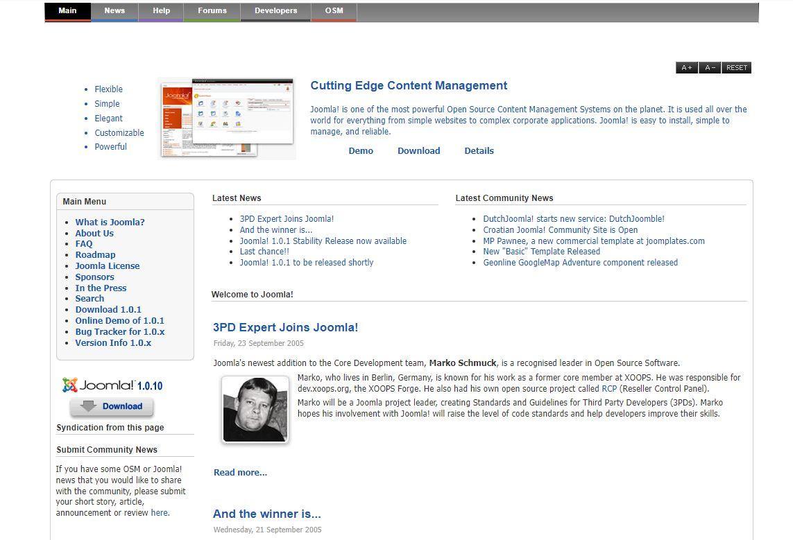
Joomla.org through the years
I have put together a series of screenshots from the Internet Archive (Wayback Machine) https://archive.org/web/.
See them all here: https://docs.google.com/document/d/1gj29JVv5gQU_C9Dv3r7H_ynwnkkJCY9gaMjUq3uJGno/edit?usp=sharing
And grabbing the oldest and most recent to show you the way it has evolved.
24th September 2005
And when the latest snapshot was taken on the 19th of April 2023.
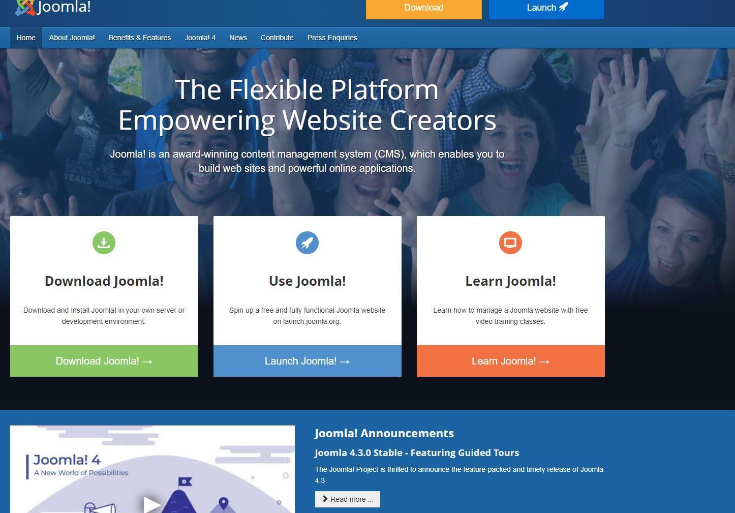
It is quite a journey of evolution Joomla.org has gone through over the years, but there has been little if no real change since 2017.
Not so much change for our next candidate.
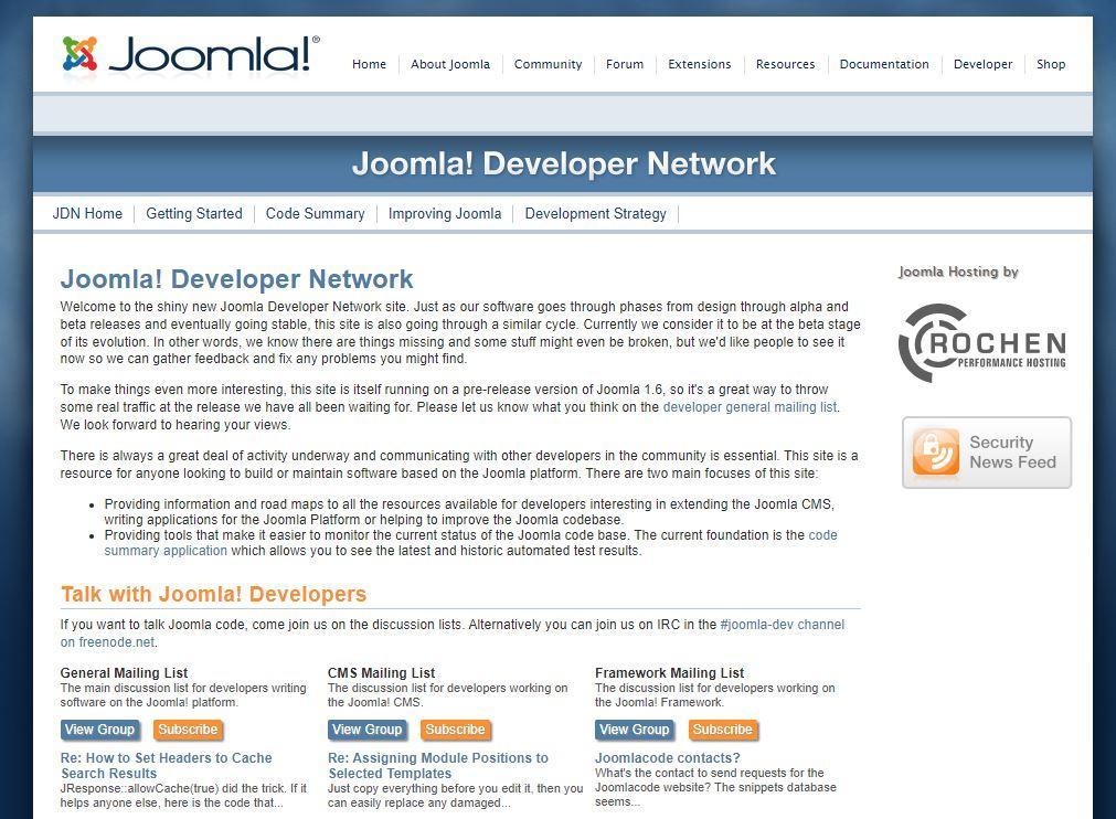
The development of developer.Joomla.org
https://docs.google.com/document/d/10qsjLQ2lBIKhIR47LmOq0nnBSijBSY0CX_vL1x5Pbts/edit?usp=sharing
December 6th 2010
And on the 19th of April 2023.
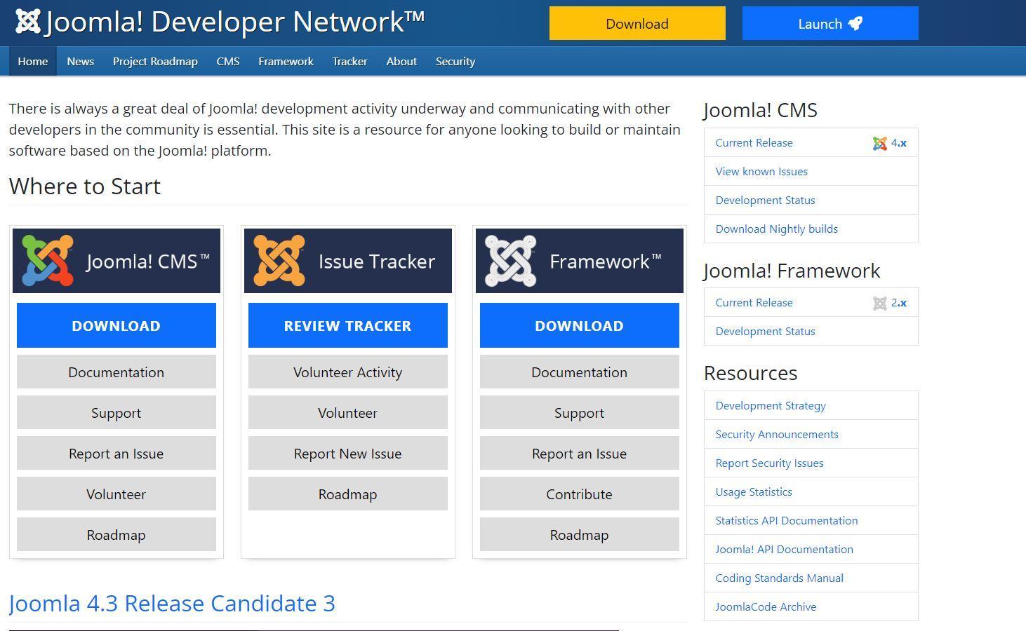
Colours may have changed but the idea of the 3 main areas remains.
Notice how the emphasis on two of the three columns was down to the CMS and the Framework; the Framework still commands a similar focus on the main page as the CMS. Yet I think the old mantra that “Joomla is a Framework and not a CMS, the CMS is just the first example of the Framework” has run its course and Joomla is most firmly seen as a CMS by the rest of the world, with the framework reserved for a much smaller selection of the development community.
Talking of community: the next under our spotlight is the community subdomain of Joomla.
Growing a community on community.Joomla.org
https://docs.google.com/document/d/1IpnG2K4YGacDidxO1mrPeaINED9ZTpsui5-NlYrJyCw/edit?usp=sharing
The Community pages start around 16th December 2008.
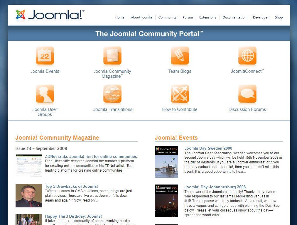
And you can see the current offering as of 19th April 2023.
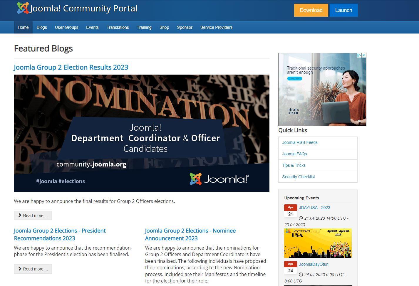
I think there is a lot we can learn from looking back through the designs from the past. Some emphasis has changed and some things dropped which I think would be wise to reintroduce.
Next, the organisation that oversees and powers Joomla.
The changing shape of opensourcematters.org
https://docs.google.com/document/d/1hhFNhgOoLnr756IMRuSYVIEbdN3lgXr98xJ9VPoVyAE/edit?usp=sharing
30th September 2005
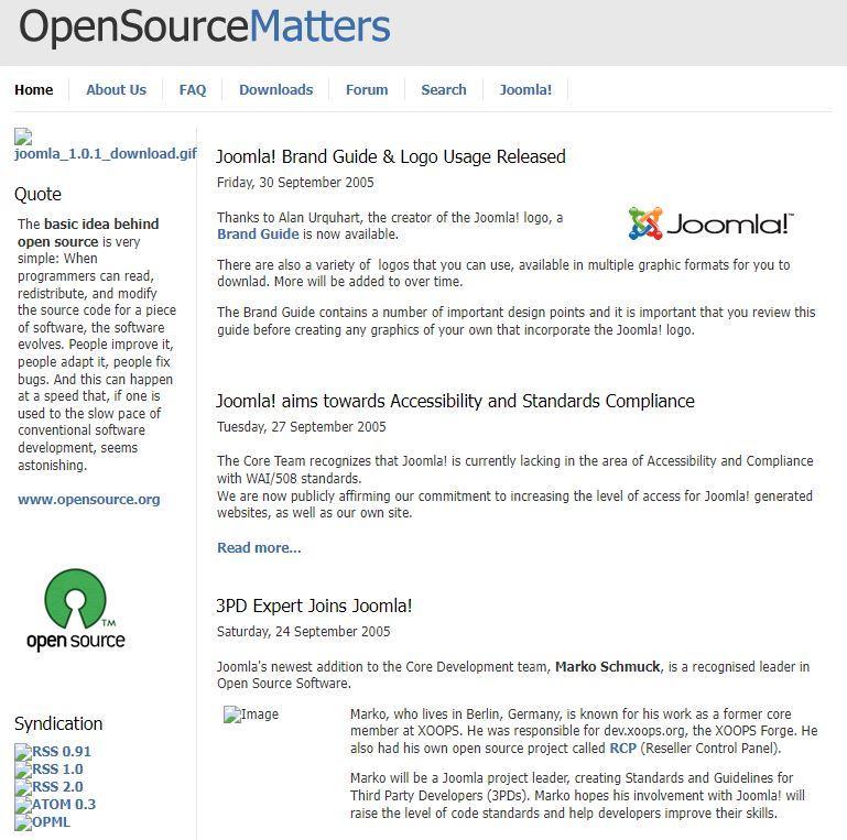
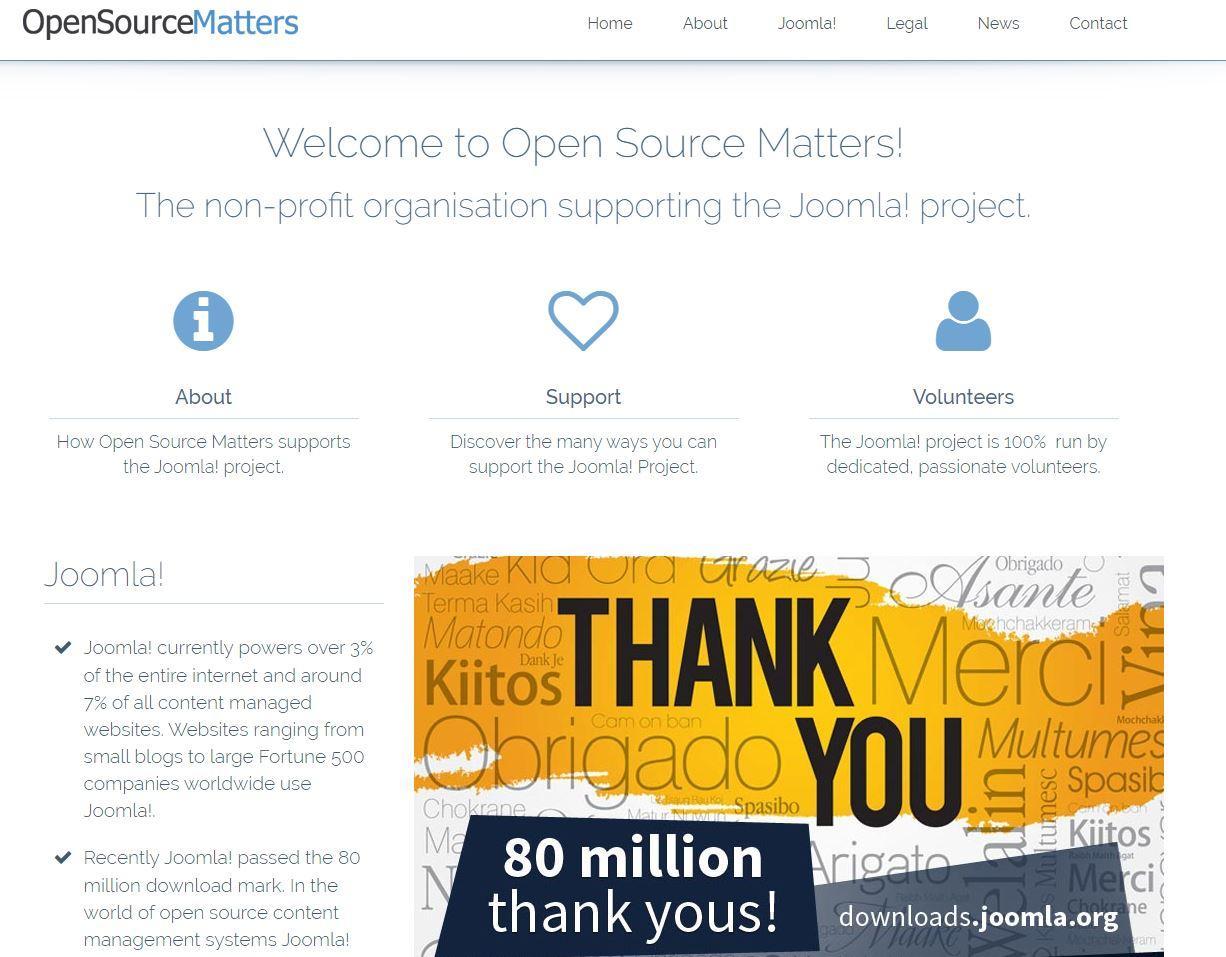
And the current site (see below) has looked the same since 2017.
Where do people land when they come to Joomla?
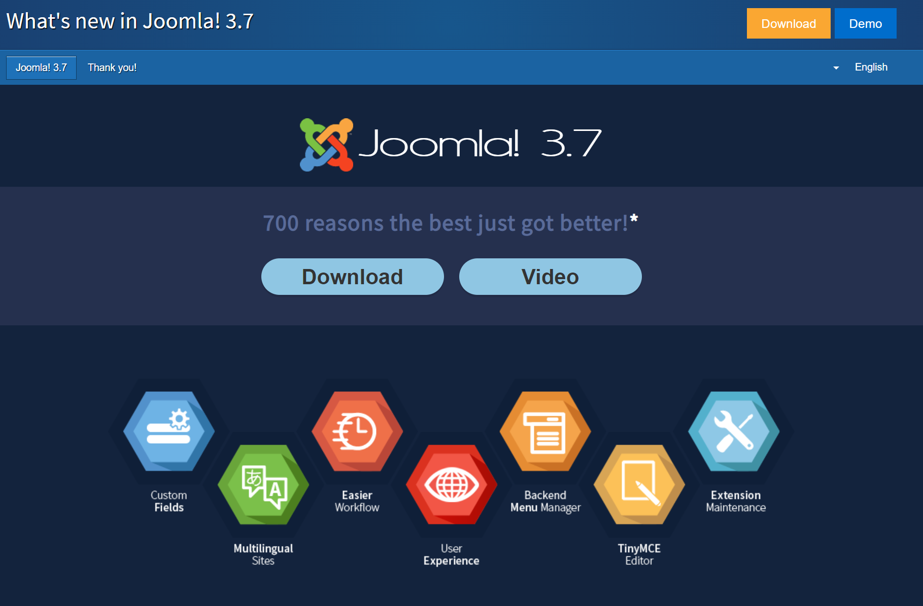
The Joomla 3 and then Joomla 4 landing pages are our chance to shout about the current version of Joomla.
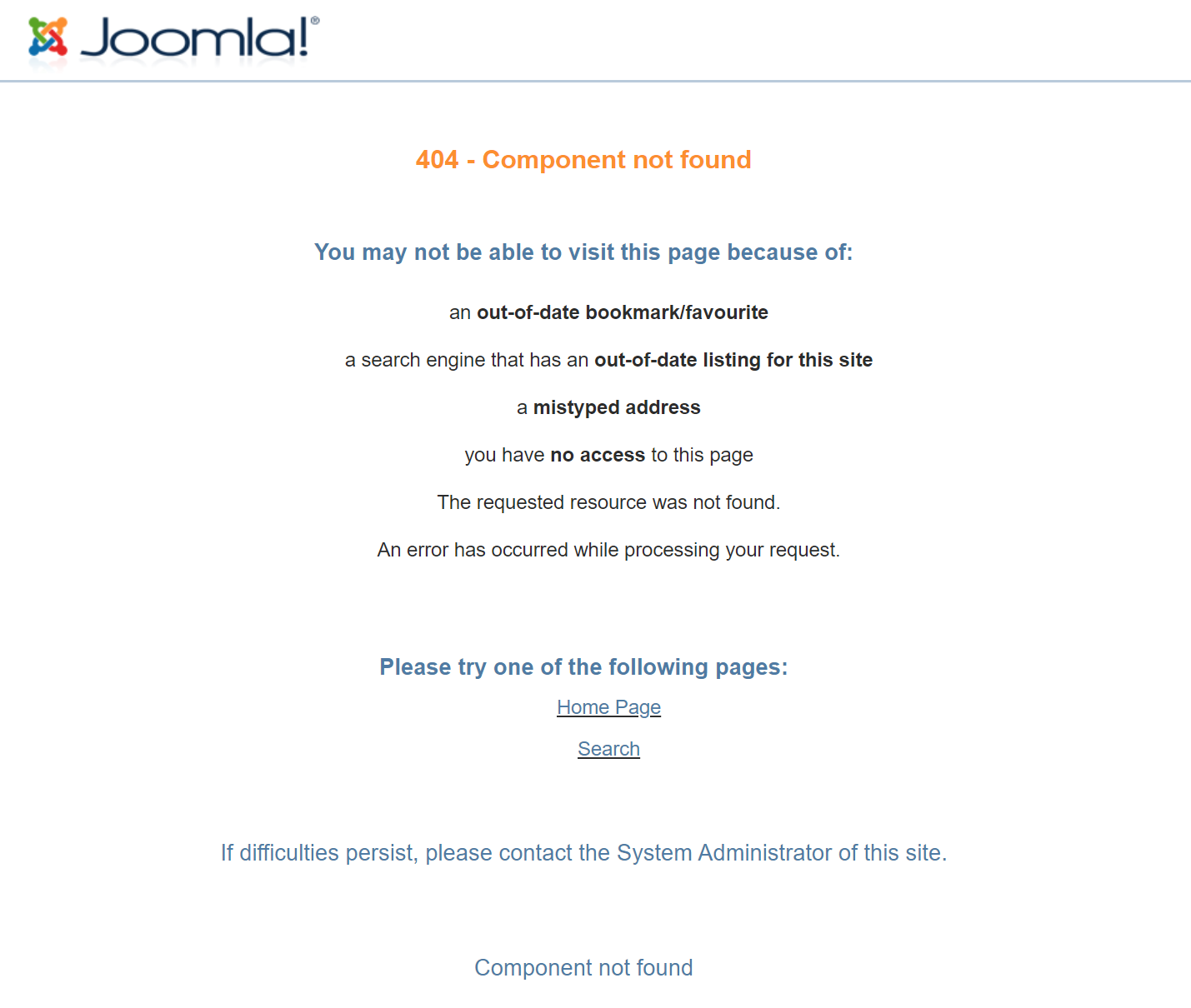
Interestingly when I went to look at early Joomla 3 versions of it I realised that we were showing “404 component not found” for a long time. This is the case at the moment with Joomla 5, so lessons learnt and a holding page is being prepared.
We then have the Joomla 3 landing page.
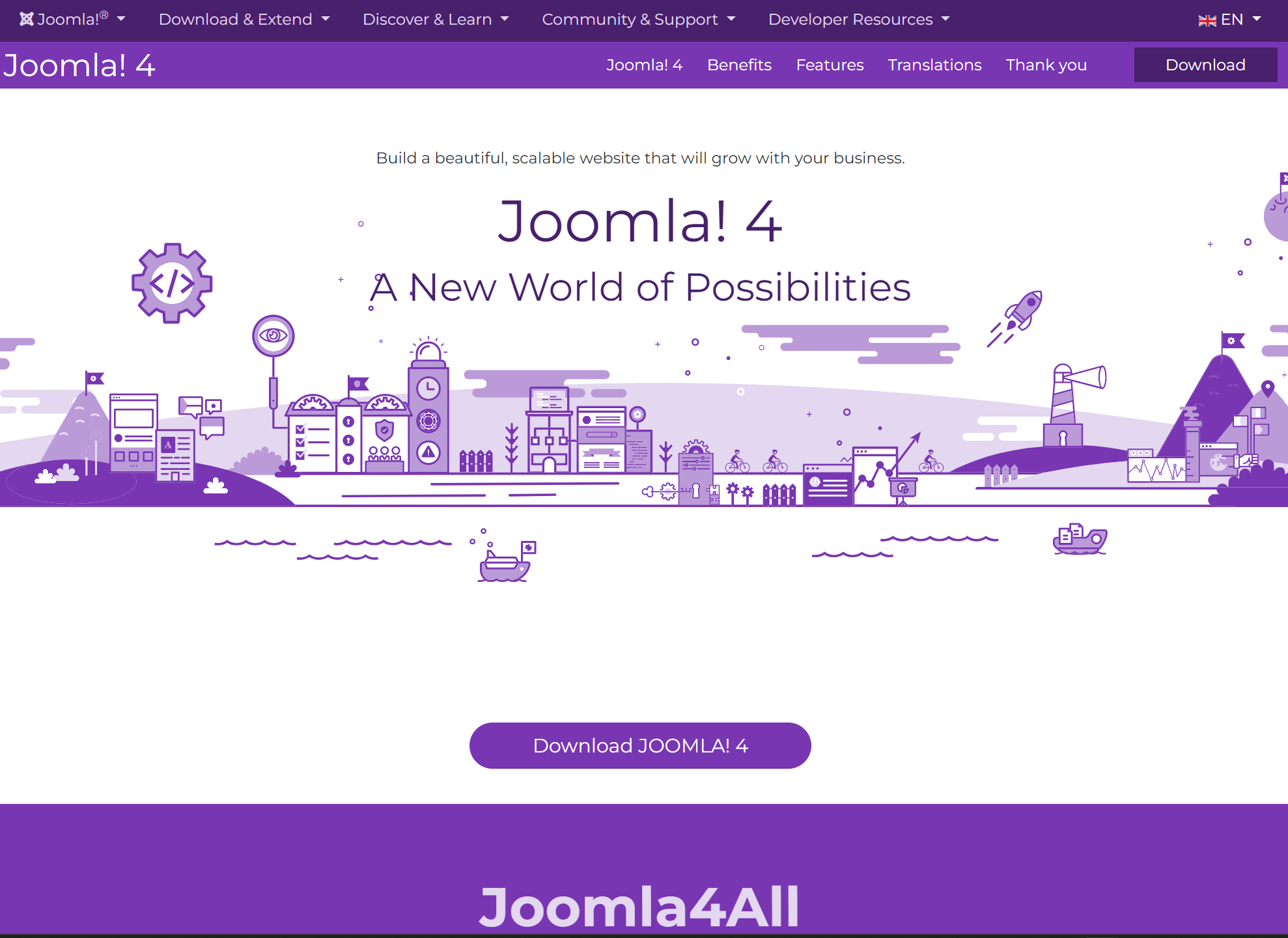
Which is now the Joomla 4 landing page and looks like this.
Learning from the past, creating for the future
After reviewing what has come before it's clear that the different areas have evolved with very different looks.
It is a lot to manage and with fewer people giving up their free time to help, it is important to rationalise and keep the best, freeing up resources to build those areas.
There are some core messages that we want to push with Joomla 5, messages that will help web agencies and individual developers win trade and bolster confidence.
These messages should be carried across our sites and be at the heart of the message we shout out.
Joomla 5 Must be
Secure - Either by sticking as much as possible to the core, or best practice extensions where needed.
Accessible - Both in terms of accessibility standards and as wide as possible language-wise, so no matter your ability, no matter your language you have a chance at using a Joomla site to get your message across.
Fast - Images and assets must be made fast from the design. The sites built on Joomla 5 for Joomla’s message should be ambassadors of best practices and speed.
Extendable - Joomla is an extendable system with its rich developer community, third-party extensions, built-in API, and innovative design taking advantage of the latest advances in PHP and third-party technologies.
This all comes together to spell out the Acronym SAFE.
But there is one further principle we want to emphasise when it comes to Joomla as opposed to other cloud-based solutions, the Wix, Shopify, and Squarespace offerings.
That word is Yours.
Joomla is Yours
With Joomla you can move your site to any hosting platform in the world, you don't have to keep it on preparatory servers in another country, bound by other laws.
With Joomla, it's yours to do with as you please, yours to host wherever you like: cloud, dedicated server, locally, intranet…
Yours content-wise: no one else should have the right to look through your content.
Yours to delete and maintain without restrictions of software or retention by others.
Reading the small print of some of the cloud services offerings such as Wix or Squarespace is quite eye-opening, but so often the “accept” button is clicked without realising the limitations and consequences further down the line. You cannot just change where your site is hosted with them. Often they want to review and use your data to help “improve their service to you,” whatever that means!
Over to you to have your say
The Joomla Marketing team have put together a few initial ideas of how they see it looking but this is really early stages and all up for discussion.
https://drive.google.com/drive/folders/1B_Xn9B3k5SA9pXK6h1P8oMawUs9CCUEQ?usp=sharing
At the time of writing this article, there are 3.
Josean's
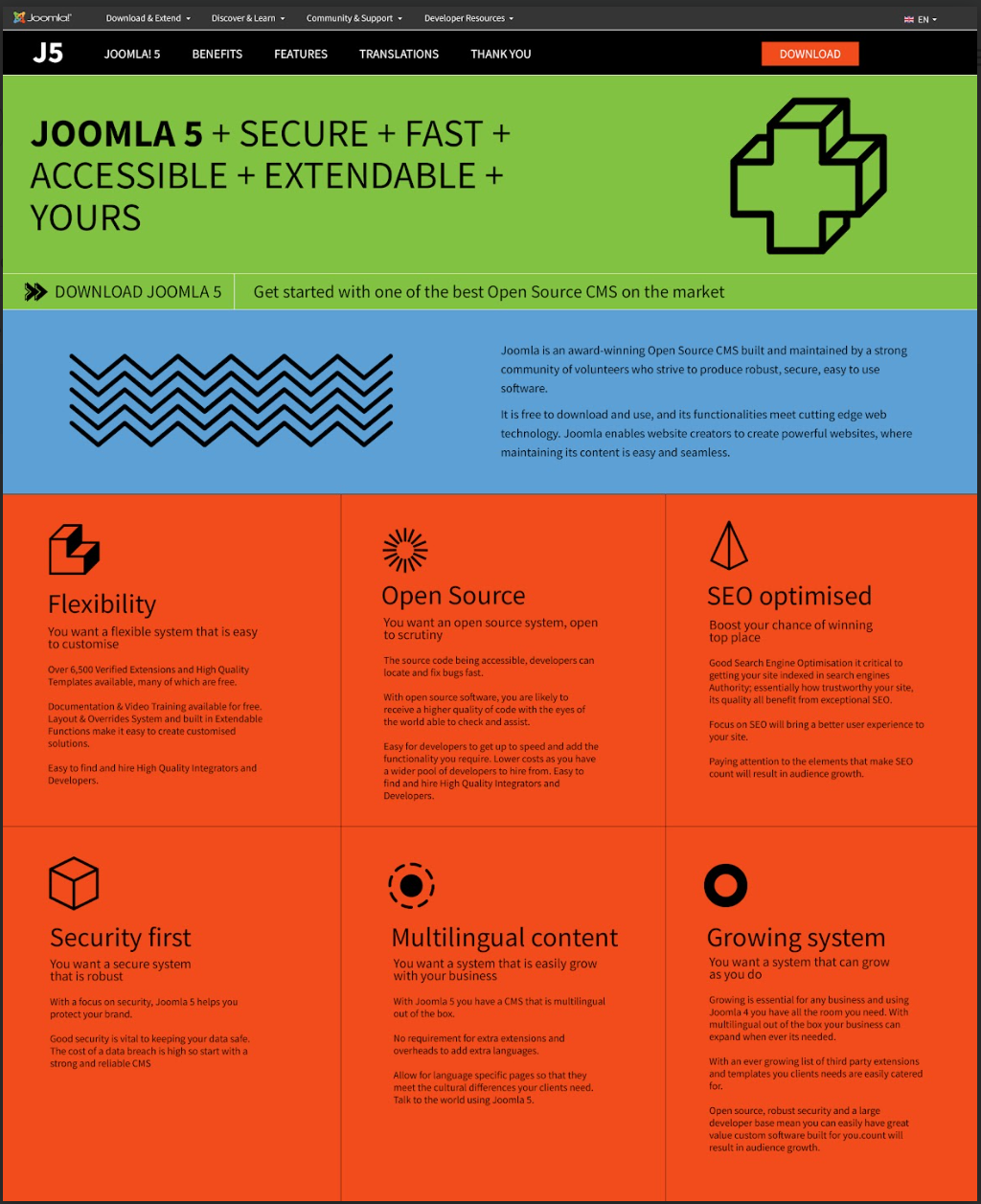
Robin's
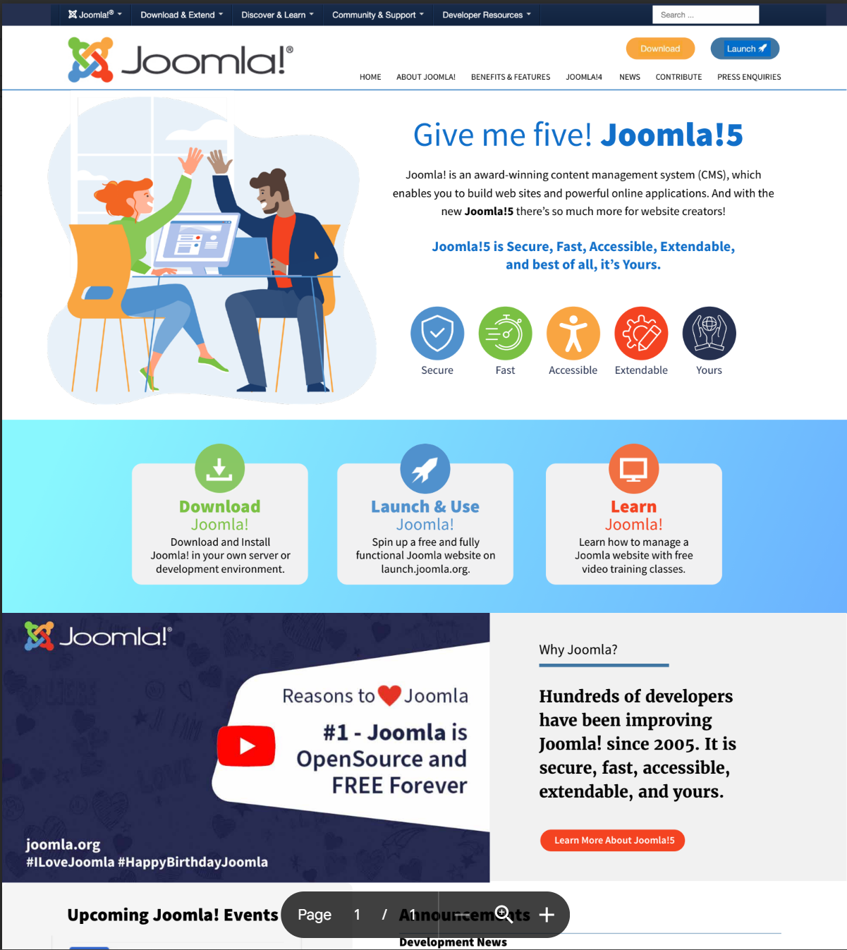
Louise's
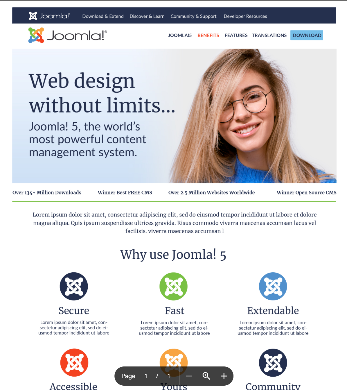
Why I designed the Joomla.org page to look like this
Below Louise has been kind enough to explain her design reasoning.
Design Notes - Lou Hawkins
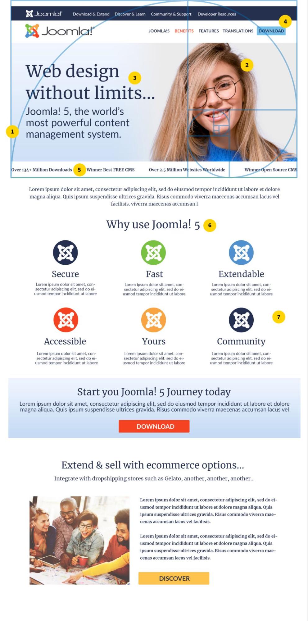
Design Notes:
The enclosed design incorporates some tried and tested design practices that are proven to increase conversions.
- Golden Ratio - Here I have used the golden ratio to best position the main elements. You can see the Golden Ratio Spiral which I have overlaid on the top part of the website. The Golden ratio helps with the positioning and size of elements in relation to each other to be the most aesthetically pleasing. I have also loosely applied the golden ratio to the scaling of headers. This is achieved by multiplying the body content font size by 1.618. https://www.adobe.com/uk/creativecloud/design/discover/golden-ratio.html
- Emotive Images - People process images much faster than text, additionally people process information differently, some use a central processing route and some a peripheral, this is known as the ELM. This is a persuasion model and absolutely fascinating! (see links) And having an image of a person facing text is even more powerful (see wordstream article)
https://alistapart.com/article/persuasion-applying-the-elaboration-likelihood-model-to-design/.
https://www.interaction-design.org/literature/article/elaboration-likelihood-model-theory-using-elm-to-get-inside-the-user-s-mind - Messaging that resonates - The hero image text is scaled loosely on the golden ratio, the message here should be one that resonates with the audience.
- CTA in main navigation - Best practices for landing pages includes your main CTA in the navigation.
- Trust Symbols - these should be placed as high as possible, viewers will subconsciously bank this information.
- White Space - Using white space to effectively focus the viewer on your message, is a proven technique.
- Margins - margins on either side make the user focus on the center of the page and the benefits.
Also important!
The submitted design was for a landing page, designed to persuade the user that Joomla 5 is the right product for them. It has to be completely user-centric, so we should view it as if we were somebody who might be new to Joomla. What would they expect to see, what would help to persuade them etc? It’s also relevant to understand where in the purchase funnel a user visiting this page would be. Possibly in the interest phase? Therefore the messaging and imagery should funnel them to the next stage. Landing pages are typically not optimised with lots of keyword-rich copy, and traffic is usually driven by ads, so if it were me I would be bidding on competitor brand keywords for a page like this. (but that's a whole other topic!)
And lastly, we should AB test a few versions of any final design within the target audience.
The Joomla! 5 Design Challenge
Introduction
With Joomla 5 on the horizon, we need to start thinking about how the latest iteration of Joomla should be presented. The opinions of marketing team members and volunteers are highly valued; therefore, we would like to give everyone the opportunity to present their ideas, and a challenge is a bit more fun!
The Challenge
Design a new look for Joomla 5 for either or both of the following pages:
- Joomla.org homepage
- Joomla 5 Landing page
The deadline for submitting designs is Wednesday 14th June 2023!
Designs can be in the format of a PDF, image file, or webpage.
The Criteria
All designs must include the following, ideally above the fold on desktop views and as high as possible on mobile:
- Joomla Branding: The design should make use of current core Joomla Branding, including typography and colours. This can include the primary, secondary and tertiary colour palettes. (A link to the Brand Manual can be found below in the resources section)
- Joomla Logo
- Top Menu and Main Menu
- Download Button / CTA
- The Five Selling Points for Joomla 5, should also be represented with an icon also. Secure, Fast, Accessible, Extendable, Yours
Challenge Resources
The following Google Drive contains a copy of the brand manual with colour references, typography guidelines, and logos.
Joomla 5 Design Challenge, how to Submit Your Design
Please join the Mattermost channel called “OR Joomla 5 Challenge” and attach your design file/image/pdf /or URL to the Joomla 5 card.
Need help with Mattermost?
It's all covered in this article https://magazine.Joomla.org/all-issues/november-2022/getting-the-most-out-of-mattermost
For anything else please do email me
Some articles published on the Joomla Community Magazine represent the personal opinion or experience of the Author on the specific topic and might not be aligned to the official position of the Joomla Project
By accepting you will be accessing a service provided by a third-party external to https://magazine.joomla.org/
 Community Magazine
Comments 8
HI
I come often on these sites and I think that indeed, they need a redesign. Even if I understand the value of joomla 5, maybe you will not redo it for each major version ;-)
In any case, now I really like the 2nd and 3rd. Really clear and functional.I hope you will make us vote on it!?
Otherwise for the JED. No news on it? is it planned to be redesigned, because I don't find the search tool great.
Regards
Hi, design is important but the message/aim have to be polished.
The actual joomla.org is so confusing. We don't understand who Joomla! is for. The information about the capabilities is not that clear and there is NO visual exemple of realization. Even if we all know it's just about templates ppl have to be sure they can have "modern and clean" website with this tools because Joomla! have the reputation to be an old tool for old ppl.
So plz make real marketing ppl working on the content before creating any design in order to have a clear aim, look on what the web industry offer in term of actual design and then design our Joomla! Landing page.
Hello,
A new design for joomla.org would be very nice and I think necessary. Obviously it should be something fresh and should apply to all areas: joomla.org, developer.joomla.org, community.joomla.org... even the actual Joomla 5 template.
I prefer Josean's. It's modern and simple.
Thank you for all this work.
I took the photo that is currently in use for the hero of the current website. It is real Joomla volunteers and a good, diverse mix of people. If anyone wants to use that image in a redesign, they are welcome to use it and can contact me for the original if you need it.
Hello everyone. I don't understand why you have to ask this question and make things so complicated. I have the impression that you're going to experience the same problem as us for our national site. All the sites should already be under Joomla 4 and soon under Joomla! 5 using the native Cassiopeia template.
If you don't like Cassiopeia, please improve it, add settings, positions, design, etc ...
The whole community would benefit and all the sites would be like Joomla!
I think it's important not to mislead new users and to present Joomla! as it is.
I like the second site much more than the other two.
The first is way too much with the colours. The third is too bland. I feel like the standard happy face stock image (which I wouldn't mind if it was a placeholder but is advertised in the explanation as a main feature with the golden ratio).
Have we explicitly approached Chiara for a design as she's been willing to help the community before and her designs are second to none.
The lack of comments here shows that the Joomla PR needs to bring their `A` game.
Sometimes management lives in a bubble and only their thoughts matter (i.e. Joomla 4 Admin theme) but outreaches like this help.