
The Blind Spots of Accessibility testing Tools - The Focus

In the last article today's topic was already mentioned: the use of the keyboard on websites. It was found that none of the testing tools detected whether a bypass element was present. In this article, we’ll take a look at what the testing tools have to say about focus.
Focus
The Focus refers to the element on a web page that is currently ready to receive input from the user. It is the holy grail of web accessibility.
Don't believe it? Imagine you've had an accident, and your hands are in casts. You can only move one finger to use the keyboard. Now check your site.
The requirement of WCAG 2.2 is clear: Make all functionality available through a keyboard.
In this issue we ask: Can automatic testing tools find issues in keyboard usage?
As in former articles of this series we use free browser add-ons for tests: WAVE, IBM Accessibility Checker, Lighthouse and we activate the built-in Joomla accessibility checker jooa11y.
To make the long story short: Recognising issues with keyboard usage is completely up to the human tester.
The size of the touch target
In WCAG 2.2 the size of the touch target must be at least 24px minimum. https://www.w3.org/TR/WCAG22/#target-size-minimum

Only one tool identifies this issue on a test site and gives a hint, it is Lighthouse (based on AXE), all other tools accept smaller touch targets.
The hidden focus ring
https://www.w3.org/WAI/WCAG22/Understanding/focus-appearance it says in short, that interactive elements must change their appearance when they get the focus.
In this magazine article you can find examples of correct usage of the focus ring on a Joomla site and the warning: Never ever use the CSS statement a:focus { outline:none } which hides the focus.
These days, it's a no-brainer, but ten years ago, it was one of the most commonly used CSS rules on websites. Why? Many graphic designers believed that the focus ring ruined their carefully crafted layouts and didn’t realize how badly this impacted accessibility. But it’s actually their responsibility to incorporate the focus indicator into the design.
And the Test Tools? Not one of my test tools recognizes a hidden focus ring. This is surprising, it should be a low hanging fruit for these tools.
The Focus Appearance
In Joomla we aim to meet WCAG 2.2 AA conformance. So we don’t need to meet the recommendations of the AAA conformance which says: The focus must be at least 2px thick and its colour must have a contrast ratio of at least 3.1 against the background.
Nevertheless it is a good idea to make the focus visible. The Cassiopeia template uses browser standards, this enables designers and developers to customize the focus appearance. And we encourage every developer to make the focus a design element of the site.
See the difference: On the right side, Cassiopeia on Firefox.

The hidden focus area
One recommendation of WCAG 2.2 says that the element which has the focus must not be overlapped entirely by another element. At least a part of the element must be visible.
This can happen when a mega menu opens and covers a big part of the page, or when a sticky header covers a part of the screen.
It is clear that tools cannot identify those issues.
The focus trap
When a modal window opens, the focus must be set into the modal window.
Sometimes, the user cannot leave the window with the keyboard, the user must click an area outside the modal. Then the focus is trapped.
There is no chance for tools to detect such an issue.
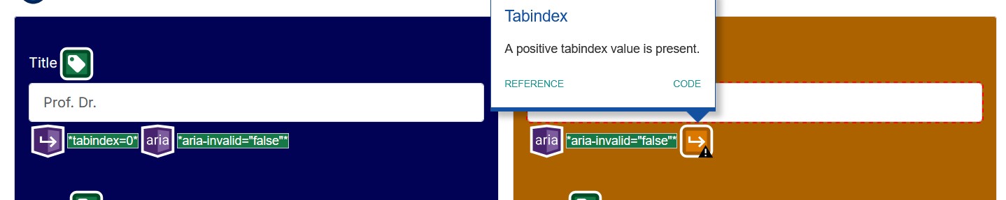
The Tab Order
WCAG requires a logical tab order. Default is - tab from one element to the next one and this is easy and understandable. Sometimes, on forms, developers decide to change the tab order. For example, if there is an input field for the academic title before the name field, the cursor is set on the name field when the page loads.
This can make sense, but a tool cannot decide what is a logical order in a certain context.
The good news: A tester does not need to tab through a complete page. Testing tools can visualise the tab order of a site which helps a lot and they display warnings if they find that tabindex is set by the user.
Example with IBM Accessibility Checker. 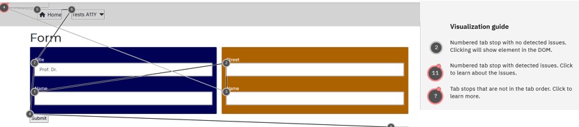
The WAVE Tool shows warning in the overview, so it is visible at the first glance:
Different tools have different visualisation, you could also look out for special add-ons, like taba11y, another tool that makes the tab order visible.
Conclusion
It is a bit frustrating, isn't it? De facto is the complete keyboard usage a Blind Spot of Accessibility Testing Tools, only the visualisation of the tab order supports the tester.
But - no worries. In the next issue of our magazine, the Accessibility Testing Tools will shine!
Some articles published on the Joomla Community Magazine represent the personal opinion or experience of the Author on the specific topic and might not be aligned to the official position of the Joomla Project
About the author
By accepting you will be accessing a service provided by a third-party external to https://magazine.joomla.org/
Comments