 Community Magazine
Responsive Design
As more web enabled devices are released on the market, people are viewing the internet with different tools. Smart phones, tablets, portable gaming devices, car entertainment units and even household appliances, like fridges, have empowered users to stay connected to the internet all day long.
However, they don't provide the most optimal viewing experience considering that most websites are designed to viewed on personal computers. Having to pinch, zoom and squint at a screen to see what you're reading is both problematic and annoying. For a while, mobile detection solved many of these problems. However, as more and more devices are released on the market, it becomes hard to keep track of the different screen resolutions and detection method required to display corresponding designs and layouts.
Currently, the most effecient solution to the multiple device problems is responsive design. If you haven't caught on to responsive design, then you might be missing out on one of the latest trends in web desing. Instead of relying on frameworks and extensions to do the device detection, individuals work purely off browser resolutions and display different layouts accordingly to match.
Responsive Design
Responsive design changes and adapts a website to how a user may perceive it. Whether it is on a mobile device, tablet or desktop computer, being able to adapt and change the designs and layouts to different resolutions and how they are being viewed can enhance the overall user experience.
It is important to note that this is different to how templating frameworks or plugins may work in Joomla. The 'traditional' or more common method of generating a mobile website is to detect what device the user is using with a particular template framework or Joomla extension and then display a template or layout accordingly.
Responsive design, on the other hand, uses CSS media queries and multiple cascading style sheets to render the layout of the website differently. More interestingly, you can have different displays and layouts depending on the orientation of a device such as a tablet switching from portrait to landscape mode.
This responsive method of design is intended to provide the user with the best experience in terms of visually displaying content to them on the device or platform that they are viewing it on.
This isn't anything new, in fact many websites use similar techniques to display print versions of website which may hide irrelevant elements except for branding and content to preserve printing resources.
Becoming Responsive
Creating a responsive website design for your Joomla website isn't a straightforward process. It requires good if not excellent HTML and CSS knowledge. One method of creating responsive templates is to use media queries.
<link rel="stylesheet" type="text/css" media="screen and (max-device-width: 320px)" href="/mobile.css" />
This CSS reference will call in the mobile.css file if the maximum screen width is 320px.
This is the same method used to display print version of your website.
<link rel="stylesheet" type="text/css" media="print" href="/print.css" />
The browser will detected what browser resolution you may have and load different style sheets accordingly. This method can also be applied to screen orientations between landscape and portrait layouts.
Another method of implementing responsive templates is to use fluid CSS layouts as opposed to fixed width layouts. Setting your website widths to 100% as well as setting images to resize is a good starting place in creating a website template that can work on many different screen resolutions.
img { max-width: 100%; } or img { width: 100%; } for IE
These techniques don't work in all browsers and should be tested accordingly but the majority of modern browsers and mobile devices will accommodate these methods which is what you're trying to target.
Without getting into the nitty gritty of template coding, more resources on implementing responsive design can be found online.
Would Your Joomla Website Take Advantage of It?
Whether your website can take advantage of responsive design or not is purely dependant on your audience.
If you find that many of your website visitors use mobile devices to access your website, or you engage with your users via Twitter or other mobile orientated social networking platforms, then getting your site across on a nice mobile/responsive design can be quite beneficial.
Future of Responsive Design for Joomla
As more and more businesses and organisations want, and require, responsive design for their websites, we'll start seeing more template companies producing templates for Joomla that are encompassing responsive design.
Seeing a few responsive design features in the core of future Joomla releases or at least distributed with the administration templates can open up a new range of possibilities for managing your Joomla website.
There are already quite a few templates out there that cater to managing Joomla on mobile and other devices other than a desktop or laptop, but imagine being able to quickly load and adapt to different screens and platforms while only using one template, and not requiring different templates for different situations.
Another area where responsive design can hugely help users is in the area of web accessibility. Users who require large amplification of the sites because of visual impairment may find it harder to navigate a website that doesn't adapt to their view point. Responsive user interfaces can vastly improve the usability.
Embracing responsive design to improve web accessibility is a win for everyone. Subtle changes to layouts on different screen resolutions can improved usability and most importantly get your online message read by the intended users.
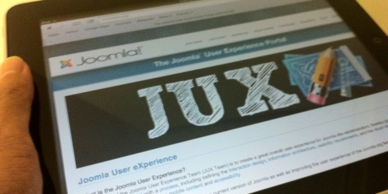
If you're interested in mobile experience and usability for Joomla, visit http://ux.joomla.org, join in and contribute to the conversations. The end result being a vastly improved user experience in Joomla for all.
Some articles published on the Joomla Community Magazine represent the personal opinion or experience of the Author on the specific topic and might not be aligned to the official position of the Joomla Project
About the author
By accepting you will be accessing a service provided by a third-party external to https://magazine.joomla.org/
Comments