 Community Magazine

In this article I will show you how to modify the blog layout and the articles module in Cassiopeia (or any other template that is using the core views) without overrides, just by applying CSS grid layout.
CSS grid layout is a powerful two-dimensional layout system for the web. With it you can organize your content in columns and rows and create complex layouts.
Photo gallery with overlay effect
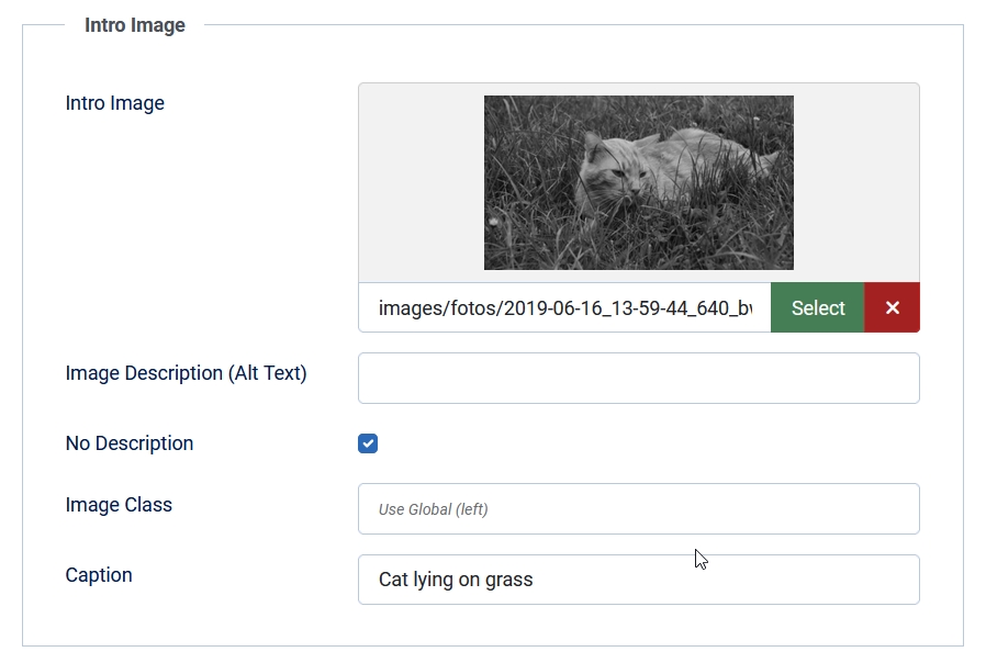
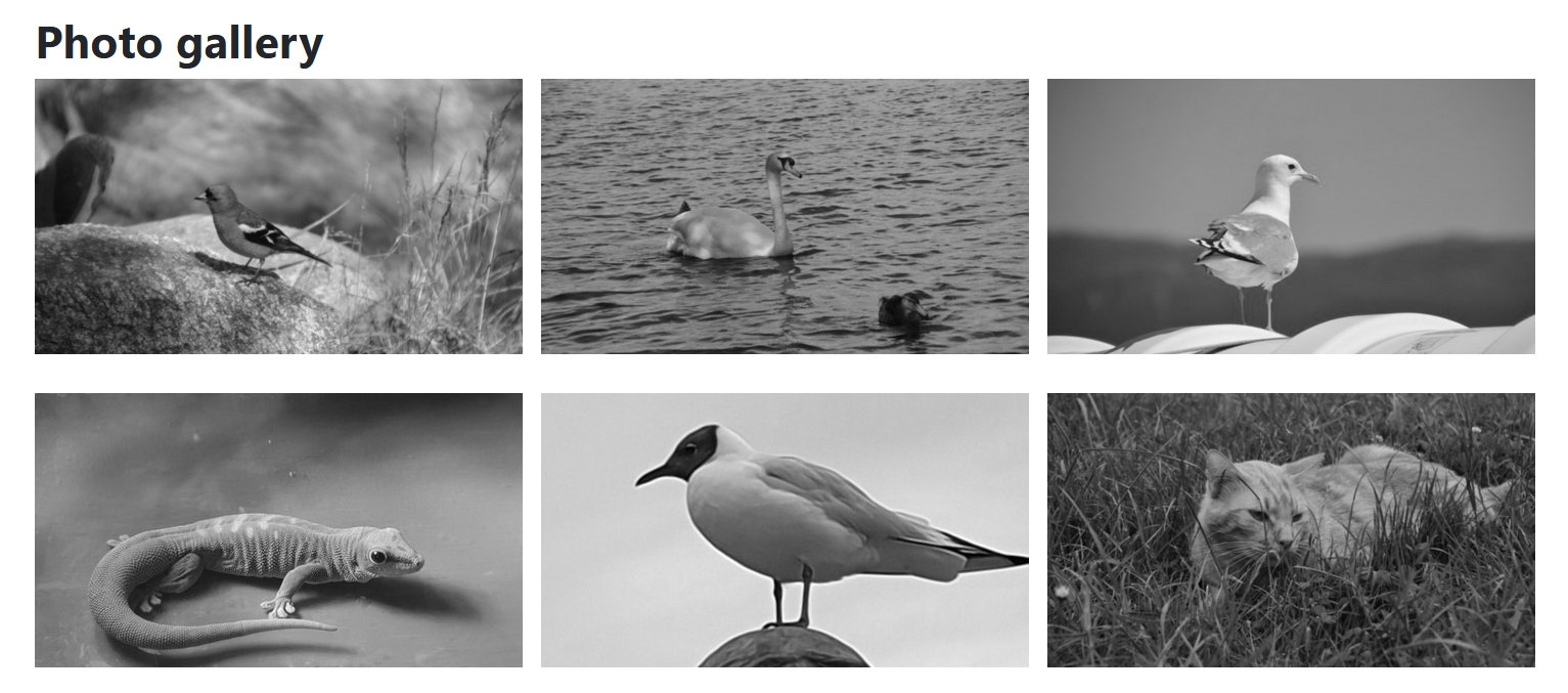
For this example I have created some articles in the category “Photos”. Each article has an intro image with a caption.
To display the articles we create a menu item of type Category Blog displaying only Intro Articles in three columns across. Under Options we hide all elements (title, author, date, etc.). We only want to have the images. In the Page Display tab we add the Page Class “gallery”, that allows us to apply CSS changes only for this menu item / blog layout. You can add the CSS for your new class in your user.css file (if you don't know how to create your user.css, read this: https://magazine.joomla.org/all-issues/june/style-your-joomla-website-articles-newsflash)
Before we modify the CSS the blog will look like this:

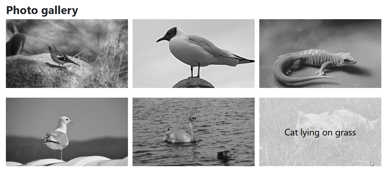
Now we want to have the caption as an overlay on the image. The code below defines a grid with one column and one row and place the image and the caption on the same cell. By using z-index we move the caption over the image. The following CSS hides the caption first and makes it visible when we hover the image. The caption is centered and gets a semi transparent background. Adding a transition and a zoom effect makes the gallery more appealing.
.gallery .item-image {
  display: grid;
  grid-template-columns: 1fr;
  grid-template-rows: 1fr;
  figcaption {
    grid-column: 1;
    grid-row: 1;
    background-color: rgba(255, 255, 255, .7);
    z-index: 1;
    display: flex;
    justify-content: center;
    align-items: center;
    opacity: 0;
    transition: all ease-in-out .6s;
    color: #000;
    font-size: 2rem;
  }
  img {
    grid-column: 1;
    grid-row: 1;
    margin: 0;
    transition: all ease-in-out .6s;
  }
  &:hover {
    figcaption {
        opacity: 1;
    }
    img {
      transform: scale(1.05);
    }
  }
}
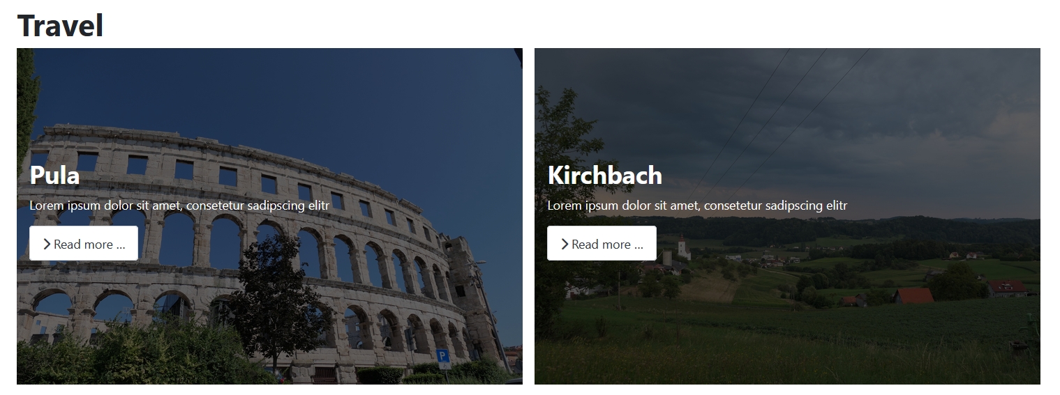
Blog layout with image as background
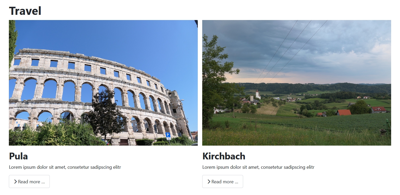
For the next example I have created several articles in the category “Travel” with intro image and intro text. The menu item is configured to display two columns across, title (without link), intro text and read more button. The result looks like this:
With a few lines of CSS we can create an overlay effect with the intro image as background and the item content on top. Again we define a grid with one column and a row and place the two elements (image and content) on the same cell. The content gets a semi transparent background to make the text better readable:
.travel .blog-item {
  display: grid;
  grid-template-columns: 1fr;
  grid-template-rows: 1fr;
  .item-content {
    grid-column: 1;
    grid-row: 1;
    background-color: rgba(0, 0, 0, .6);
    z-index: 1;
    display: flex;
    flex-direction: column;
    justify-content: center;
    padding: 1rem;
    color: #fff;
  }
  .item-image {
    grid-column: 1;
    grid-row: 1;
    margin: 0;
  }
}
The blog looks now like this:
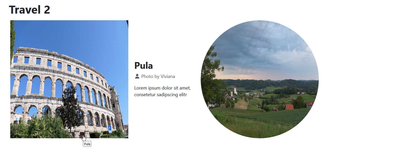
Blog with animation effect
We will now modify our travel blog to create a new layout. In the menu item we set “Linked Intro Image” to “Yes” (that is important to trigger the animation on hover and keyboard focus) and hide the read more button.
We now define a grid with two columns, the first one twice the size of the second one. The content is hidden by opacity: 0. The image is displayed as a circle (border-radius: 50% and aspect-ratio: 1/1). When the image gets focus (by keyboard) or hover, the content will appear and the circle animates to a square. The media queries modify the layout for smaller displays and devices with no mouse as pointing device.
.travel2 .blog-item {
  display: grid;
  grid-template-columns: 2fr 1fr;
  gap: 1rem;
  align-items: center;
  .item-image {
    a {
      display: block;
      border-radius: 50%;
      margin: 5px;
      transition: all ease-in-out .6s;
      &:focus-visible {
        outline: 2px solid var(--cassiopeia-color-primary);
        outline-offset: 2px;
      }
    }
    img {
      border-radius: 50%;
      aspect-ratio: 1/1;
      transition: all ease-in-out .6s;
    }
  }
  .item-content {
    opacity: 0;
    transition: all ease-in-out .6s;
  }
}

.travel2 .item-image:has(a:focus-visible),
.travel2 .item-image:has(a:hover) {
  a {
    border-radius: 0;
  }
  img {
    border-radius: 0;
  }
  ~ .item-content {
    opacity: 1;
  }
}

@media (width <= 768px) {
  .travel2 .blog-item {
    grid-template-columns: 1fr;
  }
}

@media (pointer: coarse) OR (pointer: none) {
  .travel2 .blog-item .item-content {
    opacity: 1;
  }
}
The blog now looks like this (the first image is hovered):
Bonus: Overlap effect for Articles Module
With the Articles Module it is possible to display a single article on a module position:

In the Display Options we hide all elements but the introtext and the intro image.
For this example we will create a more complex grid layout. To better understand the structure and elements placement I have taken a screenshot of the page showing the grid with numbered lines:

The grid has eight columns, the lines are numbered from 1 (at the beginning of the grid) to 9 (at the end of the grid) and three rows with numbered lines 1 to 4.
The image will be placed spanning all three rows (from line 1 to line 4) and four columns (from line 4 to line 8). The text is placed in the middle row and spans three columns (from line 2 to line 5) with an overlap over the image. The shape of the coloured background is created by the border-radius.
@media (width >= 768px) {
  .overlap .mod-articles-item-content {
    display: grid;
    grid-template-columns: repeat(8, 1fr);
    grid-template-rows: 50px 1fr 50px;
    .mod-articles-image {
        grid-row: 1 / 4;
        grid-column: 4 / 8;
        img {
            width: 100%;
            height: 100%;
            object-fit: cover;
        }
    }

    p {
        grid-row: 2;
        grid-column: 2 / 5;
        z-index: 1;
        display: flex;
        justify-content: center;
        align-items: center;
        padding: 4rem;
        background-color: #396cb0;
        color: #fff;
        border-radius: 48% 52% 67% 33% / 30% 43% 57% 70%;
    }
  }
}
This is how the module looks now:

The purpose of my CSS tutorials and how-to's is to motivate people to learn, understand and use (modern) CSS to make modifications on their websites. Sometimes a framework or an extension is too much for the use case. Sometimes you will need an override, but - as I showed in the four examples above - it is also possible to do a lot with a few lines of CSS.

Comments