Cassiopeia, Joomla’s powerful built-in template: the basics
When you start creating your website, you may want to search for a template that fits the design you have in mind. Instead of looking at extensive templates, page builders or frameworks with endless possibilities, you could also try Joomla’s core template, Cassiopeia. It looks simple, but it’s so powerful once you know how to use it. In this article, we cover the basic settings and options of Joomla’s built-in powerhouse.
Cassiopeia is the default template since Joomla 4.0. Using Cassiopeia for your next project will give you a lot of advantages:
- It was designed and created by several experienced Joomlers who know the Joomla core
- It is already installed in your Joomla instance
- It is still the default template in Joomla 5, so no need to worry about compatibility
- It uses only core views
- It delivers:
- Two extra layout chromes for modules
- One alternative layout for the Custom module
- One alternative layout for the menu module: this layout allows you to create dropdown menus and it is accessible
- It is based on Bootstrap (last version integrated in Joomla core), loads Fontawesome and Roboto font family from core
- It can be modified using CSS
- It brings several CSS classes that give you flexibility displaying content
- For more flexibility it supports child templates
- It is free
- The code stays up to date because it’s part of core Joomla
We will discuss some of these points in more detail in the next articles of this series. This article will explain the basic options of Cassiopeia.
Structure and module positions
To understand how your website will look using Cassiopeia you need to know the structure and the module positions:
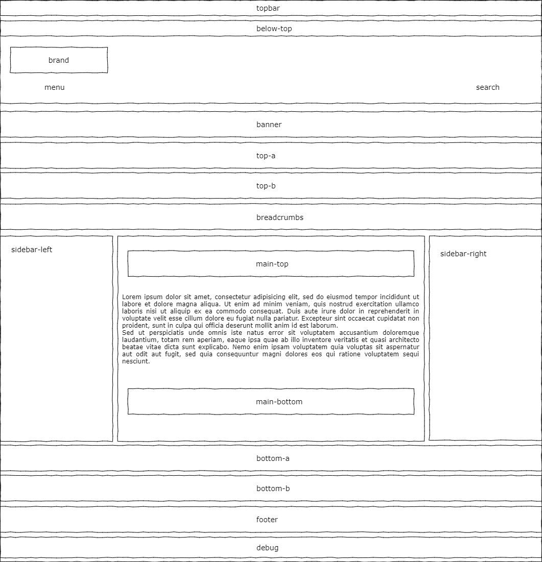
The part between main-top and main-bottom is where your content will be. You can use all the other positions to put modules in (modules are small and flexible extensions that allow you to show content on specific pages in specific positions - Joomla has a number of built-in modules for you to use).
Cassiopeia is structured with a combination of Flexbox and CSS Grid, two CSS layout concepts that allow the positioning of elements on a website in a responsive manner. It is not in the scope of this article to explain CSS concepts, but in short: Flexbox is good to control elements in an one-dimensional system (you can have rows or columns) and CSS Grid is a two-dimensional system (you can control rows and columns together). Learn more about CSS Grid here: https://blog.logrocket.com/css-flexbox-vs-css-grid/
The main structure of Cassiopeia consists of a header and a footer element and in between a container with the class “site-grid”. These three elements are inside the body that has the CSS definition display: flex with flex-direction: column. That means all three elements will be displayed below each other.
The header element contains the module positions: topbar, below-top, menu and search. The logo can also be part of the header (more details later).
The footer element contains the module position footer. Debug is a special position that shouldn’t be used for positioning modules.
The “site-grid” is a complex construct defined as a CSS grid with specific areas. Basically the grid consists of four columns that will be occupied by the different elements. On displays wider then 992px the distribution of the elements is:
banner banner banner banner
top-a top-a top-a top-a
top-b top-b top-b top-b
side-l comp comp side-r
bot-a bot-a bot-a bot-a
bot-b bot-b bot-b bot-b
That means the banner position will occupy all four columns and because of a special CSS grid trick it will be really full-width. The positions top-a, top-b, bottom-a and bottom-b use all four columns. Between the top and bottom positions you will find the main content of the site (blog, article, another component) accompanied by two possible sidebars. Sidebar left and sidebar right can have one column in the grid and the main content has two columns. If the sidebars are not present the main content will expand through the four columns.
Template options
To configure Cassiopeia you have to go to System -> Site Template Styles and click on “Cassiopeia - Default”. The first tab has only a short explanation about the naming convention for templates (for those who don’t know Cassiopeia is a star constellation - https://en.wikipedia.org/wiki/Cassiopeia_(constellation)). The tab “Advanced” contains all options you can use in Cassiopeia:
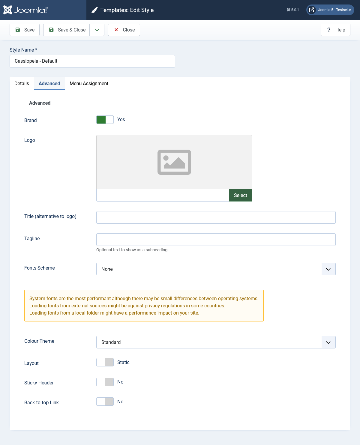
Brand
The option Brand is active by default and includes three other fields: Logo, Title and Tagline. That means you can place a logo (image) in the header of your website or replace it with a text (field Title). Additionally you can place a tagline / slogan below your logo.
If you don’t want to place your logo in the header, you can deactivate Brand and use every other module position and create a custom module for your logo.
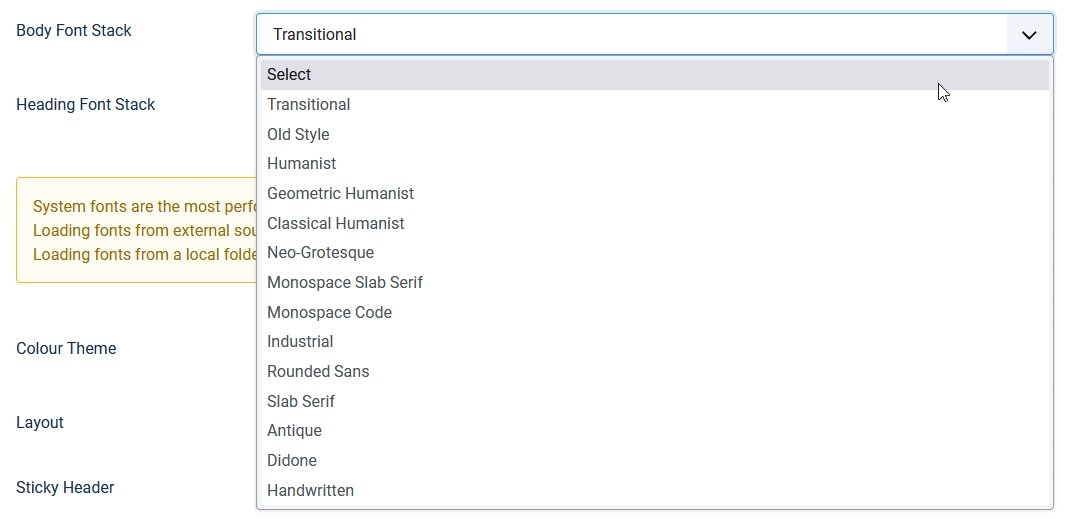
Font Scheme
Here you have three (in Joomla 4) or four (in Joomla 5) main options:
- None
- System Fonts (since Joomla 5)
- Fonts from Folder
- Fonts from Web
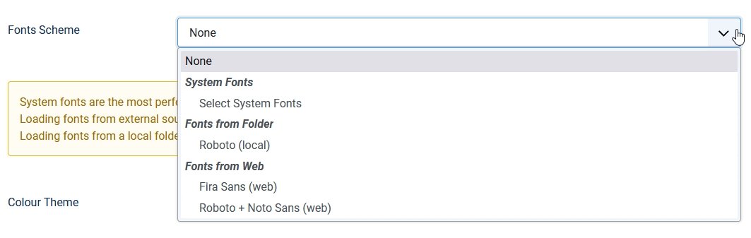
None
When selecting None Cassiopeia will use the Bootstrap definition for font-family and your website be displayed with the best available font present in the device used by your visitor. The definition for font-family looks like this:
-apple-system, BlinkMacSystemFont, "Segoe UI", Roboto, "Helvetica Neue", Arial, "Noto Sans", sans-serif, "Apple Color Emoji", "Segoe UI Emoji", "Segoe UI Symbol", "Noto Color Emoji"
System Fonts
This option is available since Joomla 5.0 and adds the possibility to select a font for body and one for headings from a list of 14 modern system font stacks. You can see them in action at https://modernfontstacks.com/
Fonts from Folder
Joomla uses Roboto as the standard font. It is delivered locally, so you don’t need to worry about GPDR and Google Fonts (want to know what this is about? Check these links:
https://www.theregister.com/2022/01/31/website_fine_google_fonts_gdpr/ and https://complianz.io/google-fonts-and-gdpr-does-it-work/)
Fonts from Web
For the ones that still want to load fonts from Google Fonts there is the option Fonts from Web with two possibilities: Fira Sans (will be used overall) and the combination Roboto (headings) + Noto Sans (body). In a next article we will explain how to add Google Fonts locally.
Colour Theme
Cassiopeia uses several CSS custom properties (aka variables) to define colors. You can change the colors in a relatively easy way by changing just these four variables. Cassiopeia delivers two different CSS files containing the color definitions.
Colors standard
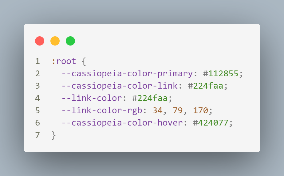
In action: https://cassiopeia.joomla.com/
Colors alternative
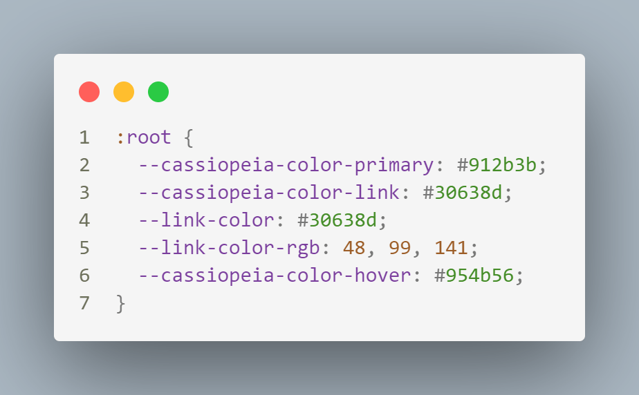
In action: https://cassiopeia.joomla.com/styles/other-style
You should not modify these files, because they will be overwritten in the next Joomla update. You can change the colors by re-defining these variables in your user.css file (a topic of a next article, but in short: you can create a user.css going to System -> Site Templates -> Cassiopeia Details and Files. Here you’ll find Cassiopeia’s structure and you can add your own CSS file).
Layout
For the layout, you can choose between Static or Fluid. Static will limit the width of the content to a maximum of 1320 px. In bigger displays your content will still be 1320 px wide. Fluid will make your content full-width, no matter how big your display is the content will always go from border to border.
Sticky Header
Would you like a header element, for example your menu and logo, to stay visible while scrolling? You can activate this option to get a header element that stays sticky on the top of the page.
Back-to-top Link
This option adds a back-to-top link at the bottom of your page.
Closing remarks
At first sight Cassiopeia can make the impression of being a very simple and inflexible template in comparison to templates from (sometimes very expensive) template clubs.
In my experience it is possible to buy the most beautiful and expensive template in the world and still create the most ugly website: if you don’t know what you are doing, or you don’t have a consistent and well-thought-out design to start with, 1000 options can’t help you to make a nice website.
On the contrary: if you understand how your template works and which possibilities you have (modules, images, fonts, colors), you can create a beautiful website with Cassiopeia just as well as with any other template. In the next articles we will go into more details about understanding and modifying Cassiopeia.
About the author
By accepting you will be accessing a service provided by a third-party external to https://magazine.joomla.org/
Comments 2
Hey Viviana,
The site-grid structure for small devices, as far as I discovered, shows the side-right-bar BEFORE the side-left-bar (line 13776 in template.css) . Is there a specific reasoning for this, or is it just a "desicion-made"? In the "@media (min-width: 992px)" section, this is NOT the case.
A customer of mine wanted this to be changed, so I had to investigate it, and successfully created an override in "user.css"
Kind regards
Ruediger
Hi Ruediger, I don't know the reason for the position of the sidebars ... in displays bigger than 992 px is the grid-template-areas
...
".side-l comp comp side-r."
...
In smaller displays:
...
".comp comp comp comp. "
".side-r side-r side-r side-r."
".side-l side-l side-l side-l."
...
For a customer I changed it to leave the sidebar-left at the top
@media (width