Style your Joomla website: The mindful movement
In the last article of this series we created a website for a fitness center called “Be fit” and added some colors to the menu and a few page elements. In this article we will stay by “Be fit” and add some movement.
Accessibility in mind
Why is this article called “The mindful movement”? It should be a good tagline for a fitness center and also a hint for the use of animations on a website.
The Web Content Accessibility Guidelines (WCAG) defines several criteria in different levels (A, AA and AAA) of conformance for making web content accessible. In general, most projects are aiming for level AA compliance and Joomla gives you an accessible base install that fulfills WCAG 2.1 AA criteria (https://www.joomla.org/accessibility-statement.html).
There are some important criteria for animated content included in level A and AA:
- Success Criterion 2.2.2:Pause, Stop, Hide (Level A): that applies to slideshows, animated illustrations, etc. https://www.w3.org/WAI/WCAG21/Understanding/pause-stop-hide.html
- Success Criterion 2.3.1 Three Flashes or Below Threshold (Level A) and the more strict Success Criterion 2.3.2 Three Flashes (Level AAA): https://www.w3.org/WAI/WCAG21/Understanding/three-flashes-or-below-threshold.html and https://www.w3.org/WAI/WCAG21/Understanding/three-flashes.html
The animations I will use in this article fall in the category of Success Criterion 2.3.3 Animation from Interactions:
“Motion animation triggered by interaction can be disabled, unless the animation is essential to the functionality or the information being conveyed.”
Where motion animation is defined as:
“addition of steps between conditions to create the illusion of movement or to give a sense of a smooth transition”
https://www.w3.org/WAI/WCAG21/Understanding/animation-from-interactions.html
The SC 2.3.3 is of level AAA, but it is not difficult to meet, as we can respect user preferences for motion with a simple CSS query.
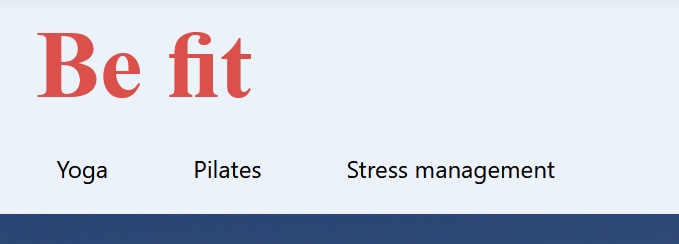
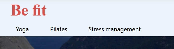
Logo resize by scroll
You probably have seen a lot of websites where the logo and / or the header changes the size when you scroll. There are several ways to achieve this effect. I have chosen a simple one that includes a few lines of Javascript additionally to the CSS. As in the articles before, the definitions used here assume the use of Cassiopeia, but can be adapted for other templates. The CSS definitions should be added in your user.css file (see explanation on a preview article: https://magazine.joomla.org/all-issues/june/style-your-joomla-website-articles-newsflash). In the same way as explained for the CSS you should create a user.js file under the “js” folder to put your Javascript.
The Javascript is necessary to add a CSS class to the header to distinguish between normal and scrolled status. When we scroll 10px the header will become the class “scrolled”:
"use strict";

window.addEventListener('scroll', () => {
    if (window.scrollY > 10) {
        document.querySelector('.container-header').classList.add('scrolled');
    } else {
        document.querySelector('.container-header').classList.remove('scrolled');
    }
});
Now we can use the class “scrolled” to change the size of the logo and remove some paddings to make the header smaller. Using the media query “prefers-reduced-motion” we can respect the user’s preferences and display the animation only when no preferences are set:
header > *,
.brand-logo img {
    transition: all 1s ease-in-out;
}
@media (prefers-reduced-motion:no-preference) {
    .scrolled .navbar-brand img {
         width: 200px;
    }
    .scrolled .grid-child {
        padding-top: 0;
        padding-bottom: 0;
    }
}
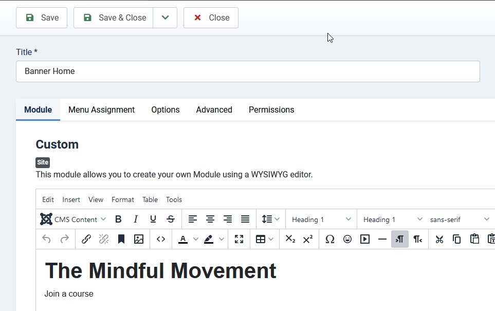
Custom module banner with Ken Burns effect
The Ken Burns effect is a type of zooming effect for images. You will probably find several Joomla extensions that offer this effect, but it is also possible to apply the Ken Burns effect to the background image of a custom module with a few lines of CSS. Cassiopeia brings an alternative layout for the custom module with which you can create a banner on your site (see example https://cassiopeia.joomla.com). The alternative layout can be copied and used on other templates too.
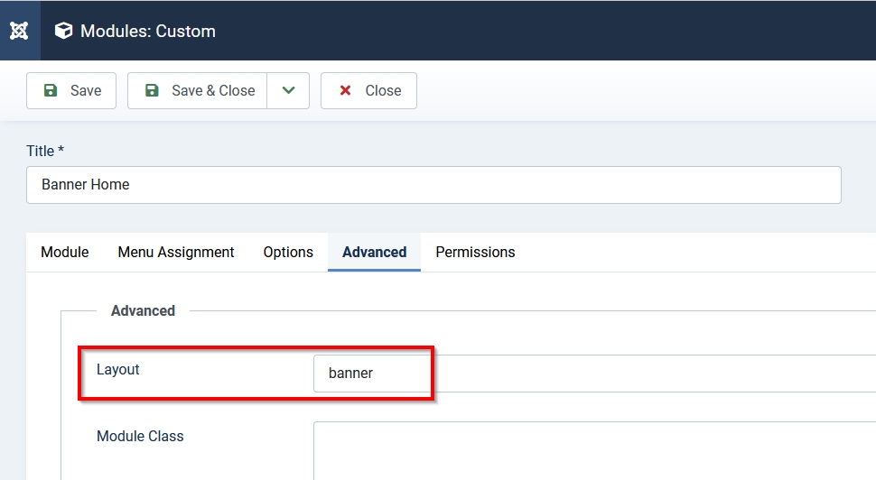
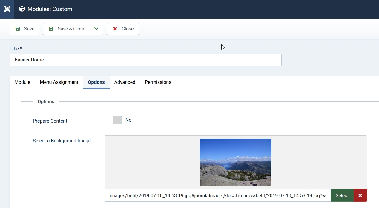
You need to create a custom module with some text, a background image and select the layout “banner”:
To create the animation for the background image I used the service from Animista (https://animista.net/play/background/ken-burns/kenburns-top-right). Here you can test a lot of animations and export the necessary code.
Again, we will put the animation code inside the “prefers-reduced-motion” query. The element “#mod-custom119” is the id of the module on my site, you will need to change it:
.container-banner {
    overflow: hidden;
}
#mod-custom119 {
    background-position: center;
}
@media (prefers-reduced-motion:no-preference) {
    #mod-custom119 {
        background-position: center;
        -webkit-animation: kenburns-top-right 5s ease-out both;
                animation: kenburns-top-right 5s ease-out both;
    }
}
/* ----------------------------------------------
 * Generated by Animista on 2023-7-21 17:8:25
 * Licensed under FreeBSD License.
 * See http://animista.net/license for more info.
 * w: http://animista.net, t: @cssanimista
 * ---------------------------------------------- */
/**
 * ----------------------------------------
 * animation kenburns-top-right
 * ----------------------------------------
 */
@-webkit-keyframes kenburns-top-right {
    0% {
      -webkit-transform: scale(1) translate(0, 0);
              transform: scale(1) translate(0, 0);
      -webkit-transform-origin: 84% 16%;
              transform-origin: 84% 16%;
    }
    100% {
      -webkit-transform: scale(1.25) translate(20px, -15px);
              transform: scale(1.25) translate(20px, -15px);
      -webkit-transform-origin: right top;
              transform-origin: right top;
    }
}
@keyframes kenburns-top-right {
    0% {
      -webkit-transform: scale(1) translate(0, 0);
              transform: scale(1) translate(0, 0);
      -webkit-transform-origin: 84% 16%;
              transform-origin: 84% 16%;
    }
    100% {
      -webkit-transform: scale(1.25) translate(20px, -15px);
              transform: scale(1.25) translate(20px, -15px);
      -webkit-transform-origin: right top;
              transform-origin: right top;
    }
}
Animate blog items
Another small movement we can use for our site is an animation for blog items. I selected the “Scale-in vertical top”: https://animista.net/play/entrances/scale-in/scale-in-ver-top
Since I want to have the animation only on a specific blog page and not generally on all blog items of my website, I added the page class “animation” in the menu item (you can read more about adding classes on my previous article: https://magazine.joomla.org/all-issues/july-2023/style-your-joomla-website-bring-color-to-your-menu ):
@media (prefers-reduced-motion:no-preference) {
    .animation .blog-item {
        -webkit-animation: scale-in-ver-top 0.7s cubic-bezier(0.250, 0.460, 0.450, 0.940) both;
                animation: scale-in-ver-top 0.7s cubic-bezier(0.250, 0.460, 0.450, 0.940) both;
    }
}
/* ----------------------------------------------
 * Generated by Animista on 2023-7-21 17:30:13
 * Licensed under FreeBSD License.
 * See http://animista.net/license for more info.
 * w: http://animista.net, t: @cssanimista
 * ---------------------------------------------- */
/**
 * ----------------------------------------
 * animation scale-in-ver-top
 * ----------------------------------------
 */
@-webkit-keyframes scale-in-ver-top {
    0% {
      -webkit-transform: scaleY(0);
              transform: scaleY(0);
      -webkit-transform-origin: 100% 0%;
              transform-origin: 100% 0%;
      opacity: 1;
    }
    100% {
      -webkit-transform: scaleY(1);
              transform: scaleY(1);
      -webkit-transform-origin: 100% 0%;
              transform-origin: 100% 0%;
      opacity: 1;
    }
}
@keyframes scale-in-ver-top {
    0% {
      -webkit-transform: scaleY(0);
              transform: scaleY(0);
      -webkit-transform-origin: 100% 0%;
              transform-origin: 100% 0%;
      opacity: 1;
    }
    100% {
      -webkit-transform: scaleY(1);
              transform: scaleY(1);
      -webkit-transform-origin: 100% 0%;
              transform-origin: 100% 0%;
      opacity: 1;
    }
}
Animate intro image on hover
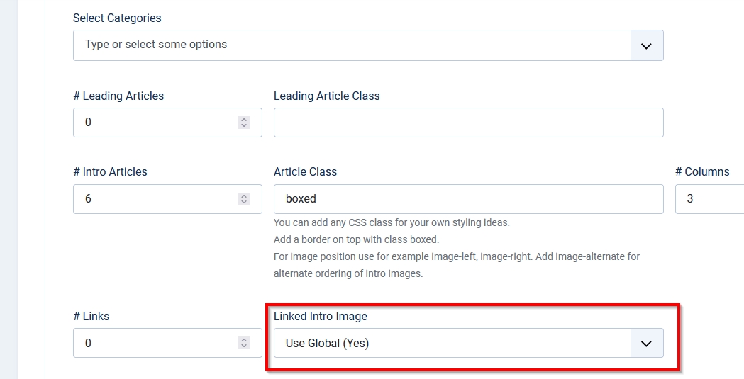
The last very easy animation I want to show you is the scaling of the intro image on a blog layout when you hover it. In order to make it works, you need to make the images linkable in the options of the blog layout (in the menu item or globally):
.item-image img {
    transition: all 1s ease-out;
}
@media (prefers-reduced-motion:no-preference) {
    .item-image:hover img {
        transform: scale(1.5);
    }
}
Small animations bring some life into your website and make it more appealing, but animations can have side effects like distracting the user from the actual content and also can be dangerous for people with vestibular disorder, causing dizziness, nausea and headaches. So please be mindful and careful with the use of movement on your website and respect the preferences of your visitors.
About the author
By accepting you will be accessing a service provided by a third-party external to https://magazine.joomla.org/
Comments 1
Great tips and beautiful animations, thank you, Viviana!