404 Error Page Best Practices [Hilarious Examples Included]
![404 Error Page Best Practices [Hilarious Examples Included]](http://magazine.joomla.org/images/easyblog_images/24f275a0444b02388db3d9fa6679982f_XL.jpg)
We've all been faced with our fair share of 404 error pages. Now think back to those experiences, do you remember how you reacted?
Let's be honest, you probably got really frustrated when a boring 404 page popped up on your screen. Chances are you don't remember anything about the page because it was just that, a boring and generic 404.
In order to stand out and create a great customer experience all of the time, you have to create a 404 error page that stands out and is actually helpful. Now you obviously don't want to be known for 404 pages since they mean there is something going wrong with your site. But you also know that mistakes do happen and you have to be prepared.
You may think your 404 error pages are irrelevant to your website, but they too should reflect your brand's personality, and most importantly give the viewer another option to click on so they don't leave your website.
Let's go through what makes a good 404 page and then review some awesome examples to get the brain juices flowing.
So Why Does it Matter?
Just to reiterate what I just said, 404 error pages are important because if for some chance a viewer is presented with one, they will want you to help them. By just featuring a general 404 page, without any options, people will click off so fast you won't believe it.
They don't want to take time to go back to your website and dig through your content to find another resource that fits their needs. Make it easy for them. Link to other resources that will help them quickly get to where they want.
404s Are Not the End of the World
When you are redirecting a page, if there isn't a good fit for the 404, don't redirect it. If it is necessary, you should find a relevant page that will provide good user experience, not a page just to redirect it.
Going around 301ing everything isn't going to provide a good user experience when the pages aren't relevant to each other. If the page receives important links or has a lot of visitors, you will want to make a 301 redirect to the page that matches the closest.
So when you can't find a good fit for a page, don't freak out. You can have a 404 error page display and if done right, you can keep them on your site. A lot of people see a 404, have a panic attack, and quickly put a 301 redirect to the homepage. Wrong! This is will only confuse people and they won't know that that page does not exist.
What to Include?
Although I have included a few hilarious examples of 404s with little to no text, it's important to include a few things in order to keep the viewer on your site.
- Tell them what's going on. You don't have to be all technical and bore them to death. All you have to do is give them a quick list of why a 404 may have happened so they understand what's going on.
- A search box is a great idea because they can quickly search what they were trying to look for right on that page. Tying into a search box is a navigation bar. With links to your most popular pages, you can get a better idea of what they were trying to access.
- Lastly, include a homepage for them to start over if they want.
Awesome 404s
Time for the good part! Let's take a peek at some awesome 404 pages that I really fancy. I'll tell you why they rock underneath the images.
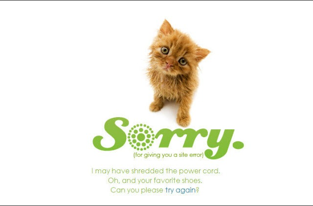
When it comes to cute animals, you can never go wrong! Looking at the example above, you will see how Center'd mastered the 404 animal page.
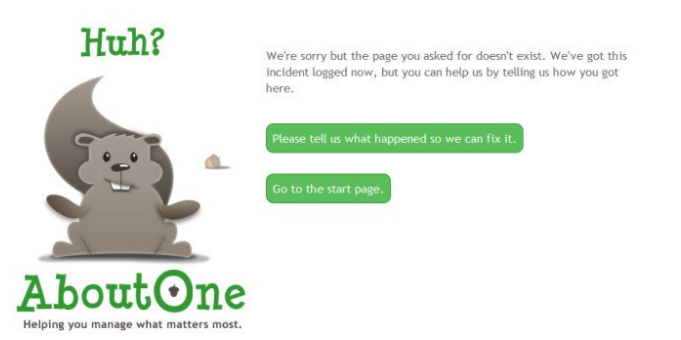
AboutOne also added a touch of cuteness with the squirrel, but that's not what I want you to notice. The best thing about their 404 page is the option to write how the person got to the page. This is a great thing because it will help the owner understand how the person got there and see any patterns happening, giving them a better way to fix it.
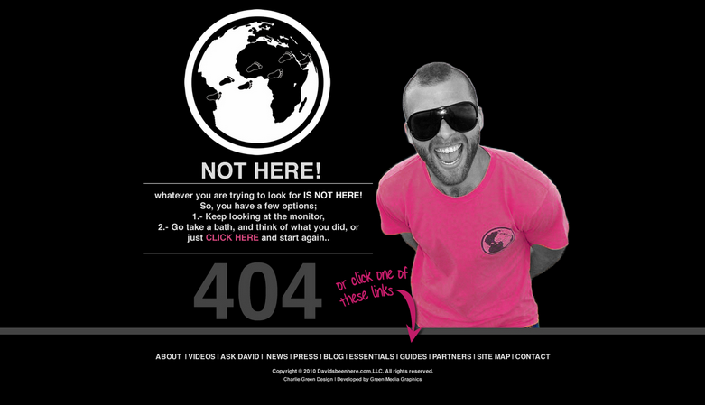
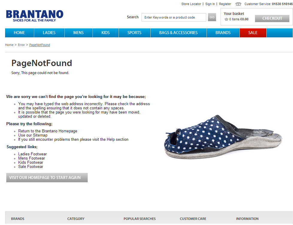
Both 404s from Davids Been Here and Brantano offered a relevant links to click on other than the homepage making it easy for navigation. (Plus, David's Been Here 404 has a funny step-by-step.)
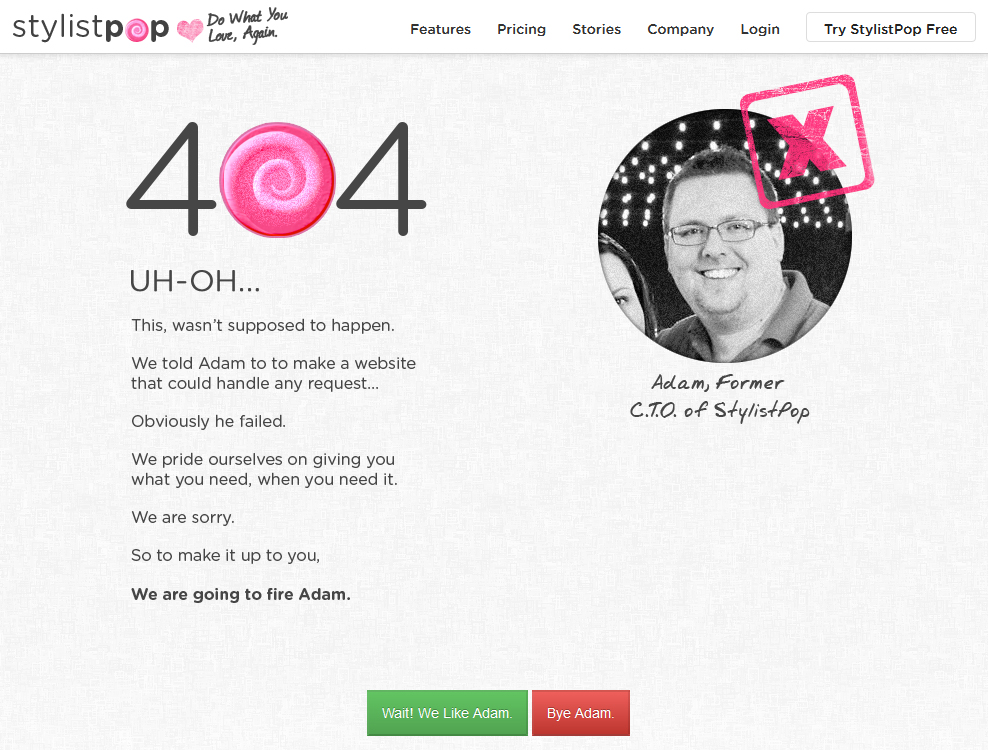
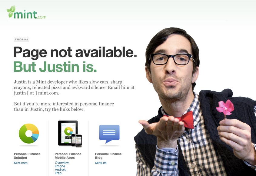
StylistPop and Mint.com do something great. They let the viewer interact with the page. It involves the viewer and evokes an emotion to avoid frustration.
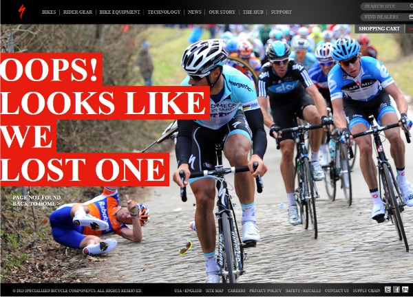
Although the 404 pages by Specialized Bicycle Components and Chris Jennings are not the best example for what helpful links and directions you should add on you page, they are so clever I just had to share!
I hope you enjoyed all of the hilarious 404 examples! Keep in mind all of the things discussed in this post in order to keep your customers happy when something goes wrong!
Ready to create one of your own 404 error pages in your Joomla website? Doing a little research will get you far but to start out, here are some instructions.
Do you have any 404 tips or funny examples to share? Post them below. Thanks!
Some articles published on the Joomla Community Magazine represent the personal opinion or experience of the Author on the specific topic and might not be aligned to the official position of the Joomla Project
About the author
By accepting you will be accessing a service provided by a third-party external to https://magazine.joomla.org/
Comments