
12 Usability Guidelines Every Joomla! Template Should Follow
Over the years I've been involved in Joomla!, I’ve seen some great improvements in templates. Many templates are now very sophisticated, slick and beautiful. Just compare the early work of any of the veteran template providers with their recent efforts to see the quantum leaps they’ve all made.
But while looks have improved, front-end usability — hasn't. Many Joomla! templates don't take usage into consideration. They’re missing some of the most basic features, making it difficult for novice developers to create a user-friendly site. I know I’m constantly hacking templates to make them do what I want.
Now that template providers have figured out how to create great templates with amazing backends, a gazillion module positions and sophisticated menus, it's time to pay attention to usability. The template providers who take that step will differentiate themselves from the crowd and stand out in the marketplace. Here are some simple guidelines that should be standard for every template.
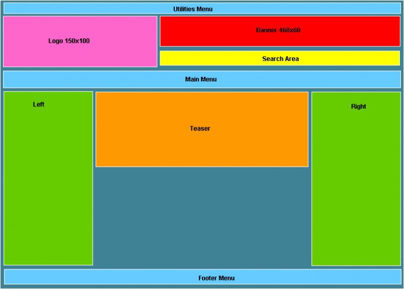
- Add a Utilities Menu
This is probably the biggest problem I find on almost every template. A utilities menu links to the features that every site needs but which aren’t the site’s main functions. They might include "About Us", "Contact Us", "Archive" etc. The menu should be located at the top of the site and a module position for it should be included in every template as standard. - Put the Call to Action on the Right
Usability experts agree: the "call to action" should be on the top right side of the screen. That could be a “Buy Now” button, a newsletter registration form, contact information, or any other important action you want people to take on the site. So, place a module position on the top right side to make adding that call to action simple. - Add Search to the Top Right
Did you know that 30 percent of users reach a site and immediately look for a search box? They don't like to browse to find content; they want to search. The search box on the top right of a website is becoming standard — it’s where users expect to find it. Every template then should have a module position at that location to insert a search box. - Include a Site Intro Box
Do your visitors know what your site is about? You only have a few seconds to communicate your site’s main message — so get it in early, and clearly. A module position somewhere on the top is perfect. It can even be a "teaser" position like JoomlaShack’s Inspiration template. Just don’t make the position too high. You want to keep that prime space above the fold for your most valuable content. - Add a Footer Menu
The footer menu is vital for items that need to be on the site, such as the "Privacy Policy" and "Terms & Conditions," but which shouldn’t take up the important space at the top of the page. Even though a footer module position is available on many templates, when used as a menu, they rarely look good. The footer module position should allow users to add a footer menu that looks inviting. - Make the logo image bigger. Too many times the space allocated for the logo is very small. Template providers need to remember that rarely nowadays, website domains are-one word short. Many times, they are 2-3 words long! Which means, more width is needed for the longer logo. Yes, I know that people can modify the CSS and make the changes, but many users don't know how, so why not make their lives easier? Recommended dimensions: 300 x 100 px.
- Allow Banners!
Banners and Google ads are almost standard for every site nowadays, so I am constantly surprised that templates don't include a position for a banner. There should be room for a standard 468x60 banner on the page. - Links Should Look Like Links
Even in the most stunningly original templates, visitors should still be able to see the links. Some templates though have page elements (such as article titles) that are not links but which look like them. Make the links one color and the other elements a different color. - Get the Text Size Right
Some templates have text so small, you have to squint to read it. Template providers should set the default text size to be large enough to read and in a color that is easy on the eyes (so no light grays, please!). Go for a 12 px text size and you should be fine. - Make the Navigation Clear
In Joomla!, the navigation is the “Next >>” and “<< Back” links at the bottom of the page. On some templates these links are so small that they are hard to see. Make them look more like clickable buttons than links, and users will find them easy to click. - Use Both Sides of the Screen
Some template providers have figured this one out already. Some haven't. Joomla! users want flexibility in choosing whether to use the left position, the right position or both. Give them the choice. Give them both. - Free the Width of the Right and Left Positions
As templates have become increasingly sophisticated, so it’s become increasingly important to allow users the ability to control the width of the right/left positions. Give them the freedom to design their sites.
Before you buy a club subscription or an individual Joomla hosting template, make sure that the templates on offer follow these guidelines. If they don't, ask your template provider to make a few changes. Hopefully, in time, these suggestions will become standard in the Joomla! world and we will all have more usable Joomla! websites.
Some articles published on the Joomla Community Magazine represent the personal opinion or experience of the Author on the specific topic and might not be aligned to the official position of the Joomla Project
About the author
By accepting you will be accessing a service provided by a third-party external to https://magazine.joomla.org/
Comments