
When designing a website one technique for people with lousy design abilities (as myself) is to use Color Wheel to choose the best matching ones that fit your design.
To be honest I struggle with this every time I have to decide a color for any part of my websites or extensions. I usually go for the ‘analogous’ option that gives me a great feeling of harmony. But what happens when you try to use the colours you get on one of these wheels in a real design? Let’s check for instance this color set:
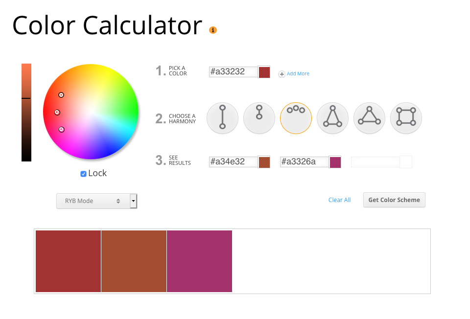
The list of colors we get is:
- Main Color: #a33232
- Color 2: #a34e32
- Color 3: #a3326a
It feels really warm and cozy, right? Now, let’s try to create a button with those colors:
These 3 buttons use the colors we just have in our palette. Can you really read the text of any of these buttons? Barely or not at all!
The reason behind this is Color contrast, which basically means the difference in light between our text color and our background color is too small: they are too similar.
Vision matters
Do not worry if you cannot read the text inside those buttons. Actually many people will not be able to. People with low vision, color blindness or color deficiency will definitely have issues with this palette. Also people with a perfectly healthy vision today might not be able to read this before the year ends, as our vision capabilities are usually reduced with age and might be seriously affected by our environment.
In fact, you can be part of those groups today. Have you ever tried to check a website on a sunny day with that bright big yellow ball on your back ☀️? Exactly! Depending on the circumstances, your vision might be diminished and your right to access information will be undermined.
Back to the web, give the web back
So we are clearly facing an accessibility issue about colour contrast, and this seems an obvious one: we just need to add black or white to our palette, and the buttons will look more clear:
Also between these two buttons, you can feel one option is more clear than the other, right? Wouldn’t it be great to have a way of measuring this and be able to choose the option that helps most users to read the texts on our websites?
That’s how we present the contrast ratio which is the numerical value assigned to the difference in light between the foreground and the background. This value will be higher for greater contrast difference, so we just need to guarantee that our site colors get a higher ratio. But how much bigger?
This is where the Web Content Accessibility Guidelines (WCAG) come in. These guidelines provide a number we can use in our tests: normal text (including images of text) must meet a contrast ratio of at least 4.5:1; large text (18 point or larger, or 14 point or larger and bold) should have a contrast ratio of at least 3:1.
As you can read, there are two different values according to the size of the text. Lower texts are usually harder to read, so we will need a higher contrast ratio for those. For bigger fonts, we can relax the contrast ratio.
Contrast testing is included in all the accessibility checkers I suggested in last month's article (https://magazine.joomla.org/all-issues/october-2020/a-first-approach-to-accessibility-testing), but if you are creating images for your social media or banners for your website, these tools will not look into these images.
The WebAIM Contrast checker is a good tool you can use, not only for testing the colors on your site but the colors in your images as well. Use a color picker to determine a couple of the colors in the picture, check those and know beforehand if your audience will be able to read the texts without contrast issues:
https://webaim.org/resources/contrastchecker/
Also, bear in mind that the contrast ratio affects, not only the initial state of the texts on your website but also when you add notifications, alerts or just change the color of links on hover. Automated contrast checker tools usually check these issues as much as your CSS allows, but in any case, it’s a good idea to do some manual checks and see if your colors have the right contrast.
As you see there are many good reasons to improve the contrast ratio in our websites and easy to use tools that help us detect and fix them. So what are you waiting for to help more people in your audience read your website?

Comments