 Community Magazine
Style your Joomla website: Bring color to your menu

Do you use Joomla’s built-in Cassiopeia template? And would you like to (re)style the pages on your website, but don’t know where to start? Then this series is for you! Joomla has some lesser known functions we can use to style our pages without the need of overrides.
In the second article of the series, we will bring some color to our menu items with just a few lines of CSS. Let’s start the makeover!
Structure
In this example, we will create a simple page for the fitness courses of the academy “Be fit”. Each course should have an individual color reflected in the menu, the title of the page and the module with the contact information.
The explanations in this article assume that Cassiopeia is in use, but the code can be adapted for other templates too.
All our changes will be put in the user.css file of our template. As we explained in the first article of this series, you can create a user.css going to System -> Site Templates -> Cassiopeia Details and Files.
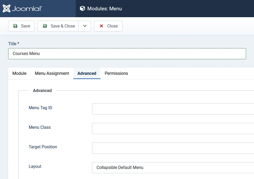
We will start by creating three articles called “Yoga”, “Pilates” and “Stress management” and a menu item for each of them. The menu module uses the layout “Collapsible Default Menu”:
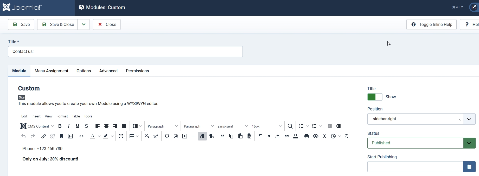
Additionally we will create a custom module on position sidebar-right to put some contact information in:
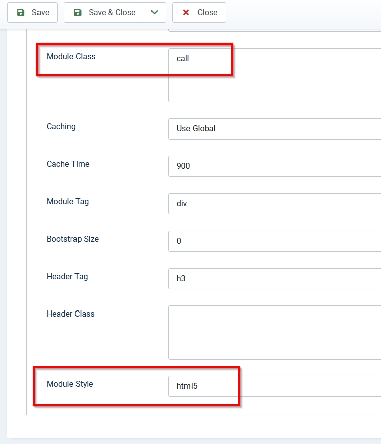
To be able to style the module later, we will add a class to it and use the style “html5” (you will find these options in the advanced tab):
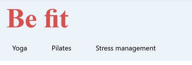
This is how our page looks now:
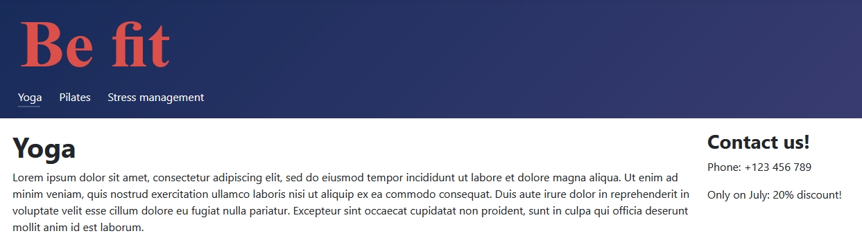
That is not really nice yet. We can do better!
Header
Cassiopeia doesn’t have many options when configuring it in the backend, but with some lines of CSS we can make great changes.
The background color of the header doesn’t match with the color palette of “Be fit”, so we will start changing it:
/* Cassiopeia changes */
.container-header {
 background-color: #ebf2fa;
 background-image: none;
}
.container-header .mod-menu {
 color: #000;
 font-size: 1.5rem;
 flex: unset;
}
.container-header .navbar-toggler {
 color: #db504a;
 border: 1px solid #db504a;
}
Paste these lines of code in the user.css file of your template. With these few lines we changed the background color of the header, the text color and font size of the menu and the color of the menu toggler in the mobile view:

That looks much better!
Menu items
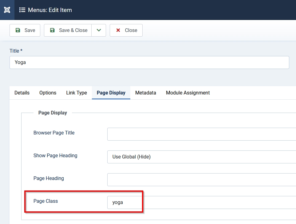
The next step is to define a specific color for each menu. On each menu item we will add two CSS classes:
- Page class will allow us to specify CSS definitions for the whole page
- Link class affects the item itself
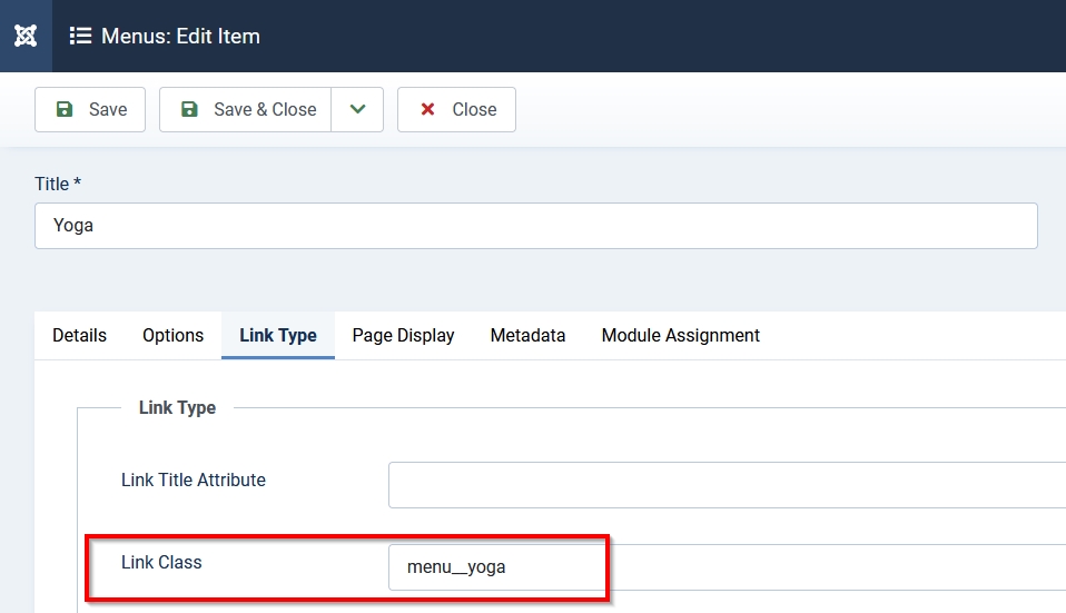
For the other menu items we use the classes “pilates” and “menu__pilates” and “stress” and “menu__stress”.
Our goal is to add a border to each link when the menu item is active or is hovered. We will create one styling for mobile (border bottom) and one for desktop (border-top):
/* Menu */
@media (max-width: 767px) {
  li.active a.menu__yoga {
    border-bottom: 6px solid #064789;
  }
  li.active a.menu__pilates {
    border-bottom: 6px solid #db504a;
  }
  li.active a.menu__stress {
    border-bottom: 6px solid #679436;
  }
}
@media (min-width: 768px) {
  .container-header .mod-menu a {
    border-top: 6px solid transparent;
    display: flex;
    padding: .5em 1em;
  }
  .container-header .mod-menu li {
    padding: 0;
  }
  a.menu__yoga:hover,
    li.active a.menu__yoga {
    border-top: 6px solid #064789;
  }
  a.menu__pilates:hover,
    li.active a.menu__pilates {
    border-top: 6px solid #db504a;
  }
  a.menu__stress:hover,
    li.active a.menu__stress {
    border-top: 6px solid #679436;
  }
}
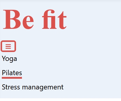
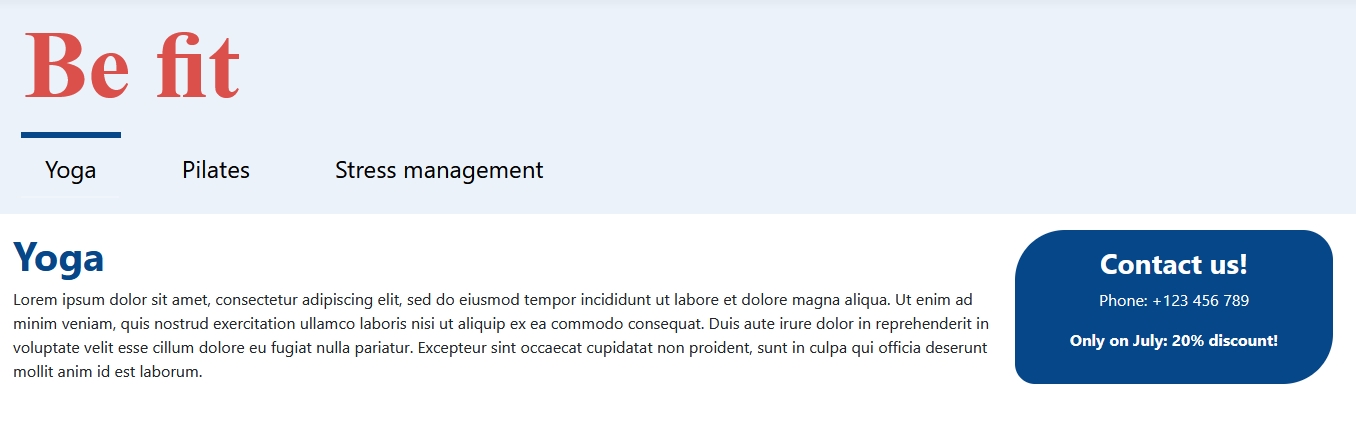
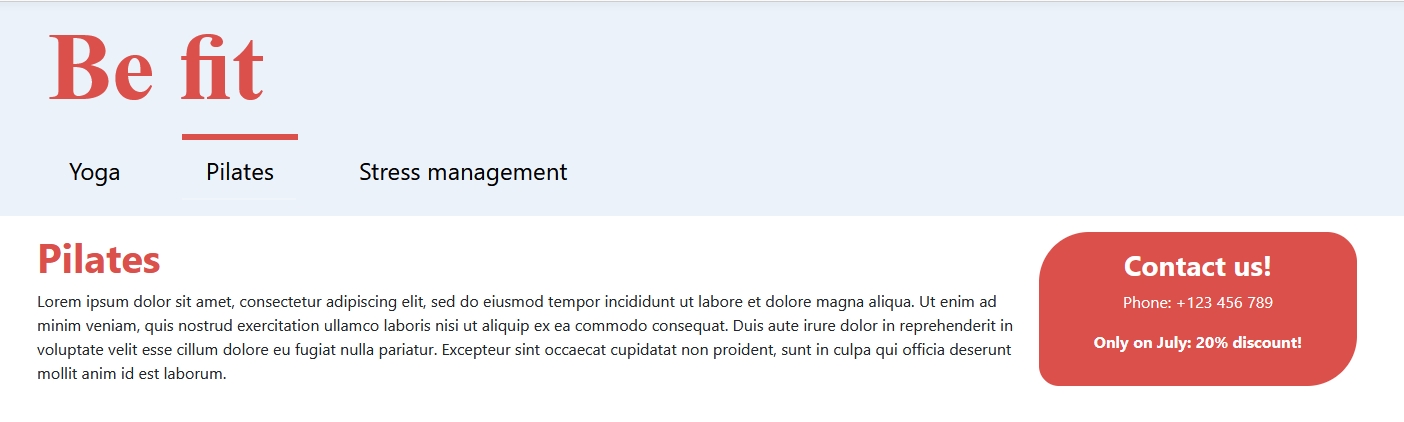
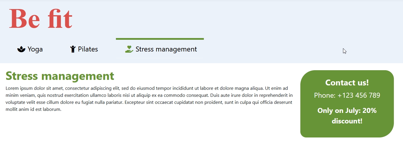
The result looks like this: the “Yoga” menu item is active and has a blue border on top. The “Pilates” menu item is hovered and has a red border on top:
 In the mobile version the menu items have a border bottom in the corresponding color:
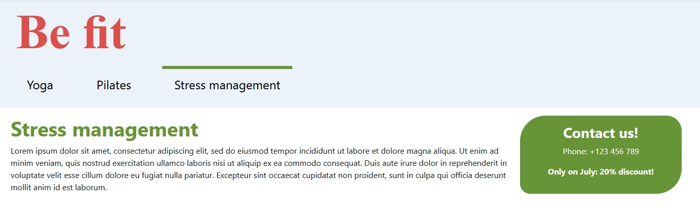
Colors for the page
We added a CSS class for each page (yoga, pilates, stress). This class is added to the body element and we can use it to modify all kinds of things on each page. For example we can change the color of the page (article) title:
/* Page */
.yoga h1 {
 color: #064789;
}
.pilates h1 {
 color: #db504a;
}
.stress h1{
 color: #679436;}
We also have the “Contact us!” module on the sidebar and it should match the color of the course too:
/* Module */
.call {
 color: #fff;
 padding: 1em;
 text-align: center;
 border-start-start-radius: 50px;
 border-start-end-radius: 30px;
 border-end-start-radius: 20px;
 border-end-end-radius: 50px;
 font-size: 1.5em;
}
.yoga .call {
 background-color: #064789;
}
.pilates .call {
 background-color: #db504a;
}
.stress .call{
 background-color: #679436;}
At the end we have a nice looking website with several elements matching colors:
We only used core functions (adding classes to page, link and module) and a few lines of CSS. No need for overrides, although I like them very much ;-)
Do you want a cherry on the cake? Here we go!
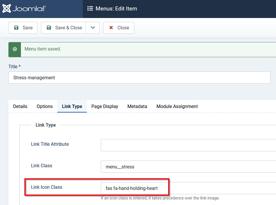
Besides the “link class” you can add a “link icon class” to each menu item. Since Joomla has Fontawesome on board, you’ll use Fontawesome classes:
Add another few lines of CSS:
/* Icons */
li.active a.menu__yoga span {
color: #064789;
}
li.active a.menu__pilates span {
color: #db504a;
}
li.active a.menu__stress span {
color: #679436;
}
And voila:
 I hope this article has given you an understanding of the possibilities of Joomla and simple styling with CSS.
If you have any questions or ideas, please share them with us.
Some articles published on the Joomla Community Magazine represent the personal opinion or experience of the Author on the specific topic and might not be aligned to the official position of the Joomla Project
About the author
By accepting you will be accessing a service provided by a third-party external to https://magazine.joomla.org/
Comments