Colour and Its Influence on a Website
This is the first of a series of articles where we will study the use of graphic elements to reinforce the website’s message in a subliminal manner, given that the message is also provided “explicitly” by the website’s text and images.
The colours that you use on your website can affect a visitor’s ability to carry out what they want to do; they are not just there to make a site look “pretty”, but also they send a message… and this has to match the message of the site.
Significance and Influence
There isn’t just one theory on how colour influences people’s emotions, thoughts and actions, so we have chosen the aspects which the theorists tend to agree on, so as to give you a general overview that includes the key essentials.
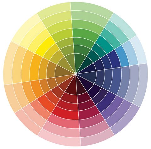
We will start by establishing which colours are different from each other, yet at the same time are similar, or rather they have comparable elements.
To put it simply, the color red portrays emotional and combative attitudes; contemplation and rest are associated with blue; yellow is happiness, white is pureness and black represents what is inexpressible.
If we consider the colours with regards to their characteristics and related language, red is intense and violent and blue is deep and full of goodness. With the colour blue, a mind is able to drift off, but not with red. Yellow is both intense and deep, but in a light manner; it is thought of in certain ways to exceed strong colours; it’s like an escape towards white.
When yellow is mixed with blue, a sense of hope is added to the retrospective element, a liberating happiness, a freedom different to the restfulness of reflection. Red excites, awakens and reveals; blue observes and reflects; yellow is cheerful and liberating.
Red is aggressive and acts towards the exterior; the irradiation of blue is deep, inviting, and unfurls itself in all the senses. The mix of reflection (blue) and happiness (yellow) is hopefulness (green); hope is the opposite of passion (red) because hope is something of the future, not the present, and also because it’s happy and introspective.
Purple is too deep, since it’s made by mixing two heavy colours, one warm and the other cold; orange is too warm because it is made up of two warm colours, one heavy and another light. Green is the combination of a heavy colour and a light one, one cold and the other warm, so is the most fortunate of the mixes. In purple the elements mixed are too different, in orange they are too similar; green unites two colours situated in opposing planes so don’t conflict. If orange is seduction, purple is regret and green is forgiveness.

In the trio of colours made, green is at the top and the one which liberates, as yellow is one of its base colours.
Green is hope, promise, waiting with happiness and good news; it has a happy and playful side; not like the violent red, the closed recollection of blue, or the open, simple, radiant joy of yellow.
Red is the present. Green is the past (blue) and the future (yellow).
Oppositions
Red and green are in direct opposition to each other; however between yellow and blue there is a harmonious difference, so the relation is complementary. Equally, blue and red, on one hand, and red and yellow, on the other, oppose each other harmoniously; the first pair because one is cold and the other warm, and the second pair because one is strong and one is light. The first opposition expresses royal dignity, with rigour and generosity, and the second has joyous intensity, consisting of voluptuousness and happiness.
Red with green despite their differences, symbolize also love and knowledge on a superior level, so they differ in attitudes but share an objective. Their transcendental synthesis is found symbolized in white. Blue and yellow represent contemplation and giftedness (intuition) respectively, and are the two poles of the essentials in knowledge. White is the synthesis that transcends the red-green opposition, whilst the blue-yellow synthesis is direct -> green is a mix, not an addition.
White is the super-colour and black is the no-colour.
Red is to white as passion is to purity and virginity… and to black as life is to death. Colours also have negative aspects, historically they have been called “damaging”.
Negative aspects
Red has a negative aspect for its violence in opposition to the serenity and peace of white. Green can be deceitful and venomous in its manner, also yellow and black can have these qualities. Yellow in that it contradicts blue as a seducer of false paradise, interiorization, recollection… and black because it denies white, as ignorance denies knowledge, or culpability excludes innocence.
Blue and white are not thought of to have a negative meaning: blue because its irradiation is circular, and therefore contemplative, so is neutral, and white because it is absolutely neutral, transcendent and primordial.
Of course we haven’t mentioned the different graduations of all the colours, but this would involve writing a never-ending article. However, from using the common ideas it is possible to see the variety of characteristics.
In following articles we will see how colours, shades, and image content are being used, as well as web site studies and applications, in order to be able to understand their real use, after having understood the theory.
Original title: El color y su influencia en un sitio web
Author: Manuel Rubio
Some articles published on the Joomla Community Magazine represent the personal opinion or experience of the Author on the specific topic and might not be aligned to the official position of the Joomla Project
By accepting you will be accessing a service provided by a third-party external to https://magazine.joomla.org/
 Community Magazine

Comments