How to create a full screen photograph home page
Everything I am going to show here could have been done by creating my own template but as I wanted to ensure that it would be future proof I have done it with CSS, a tiny bit of javascript, and existing Cassiopeia template options.
Caveat: I am not a front end developer so I am sure there are many other ways to achieve the same thing - this is just how I did it.
The objective
Build a web site for a beach club with a full screen photograph of the beach on the home page.
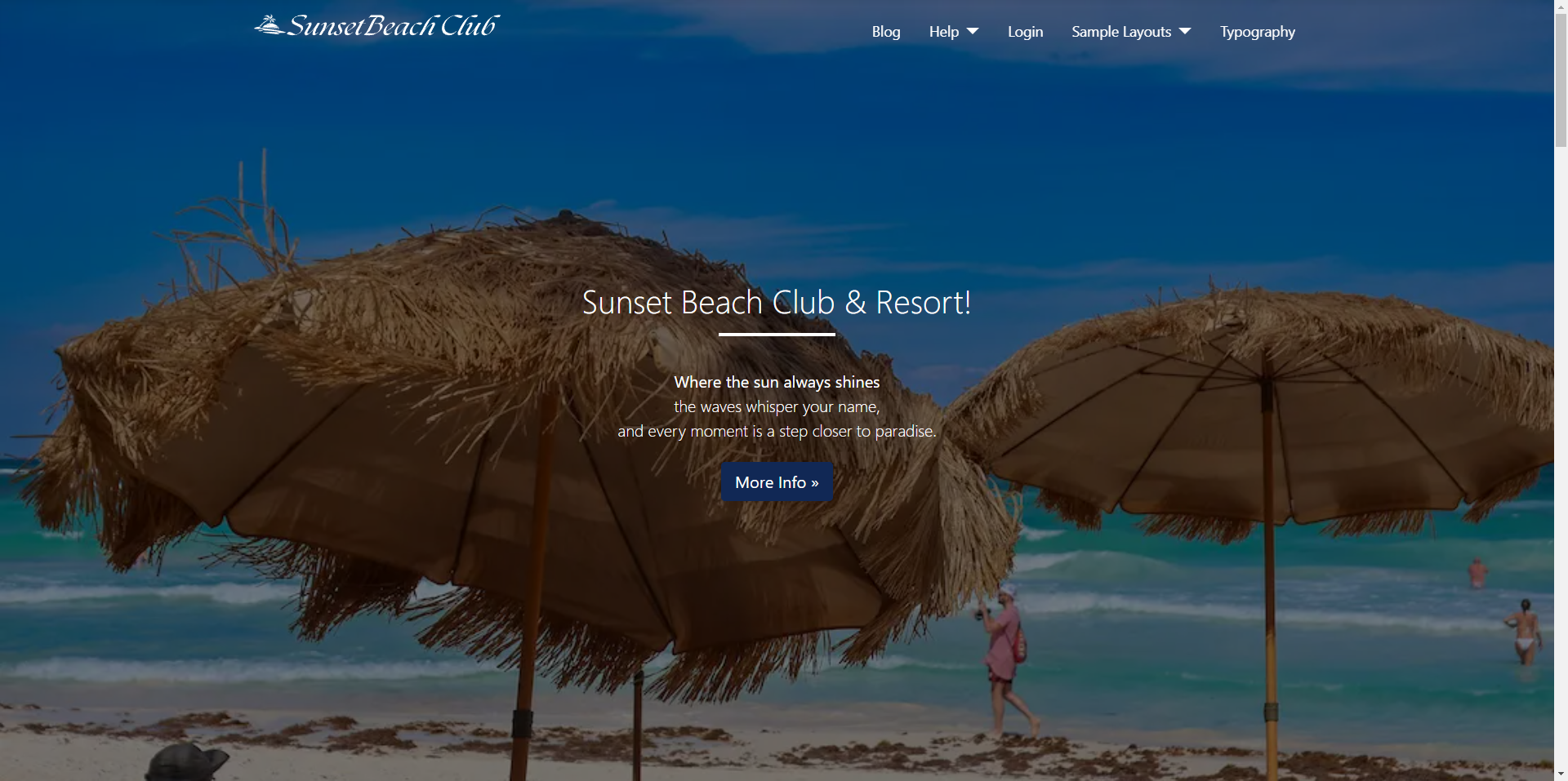
Part 1 - The Image
Add a Custom Module with a background image of the photograph we want to use and publish this module in the banner position with the layout banner.
I am using a photograph from unsplash that I have resized to a width of 1100px and compressed with squoosh so it is only about 80k in size.
The Menu
If you don't already have one then add/move the menu to the position menu with the layout Collapsible Dropdown
The Logo
The Cassiopeia template style has an option to display a brand logo. For now I am adding an image that has a height of 50px.
Result of Part 1
At this point the top of your site will look similar to this.
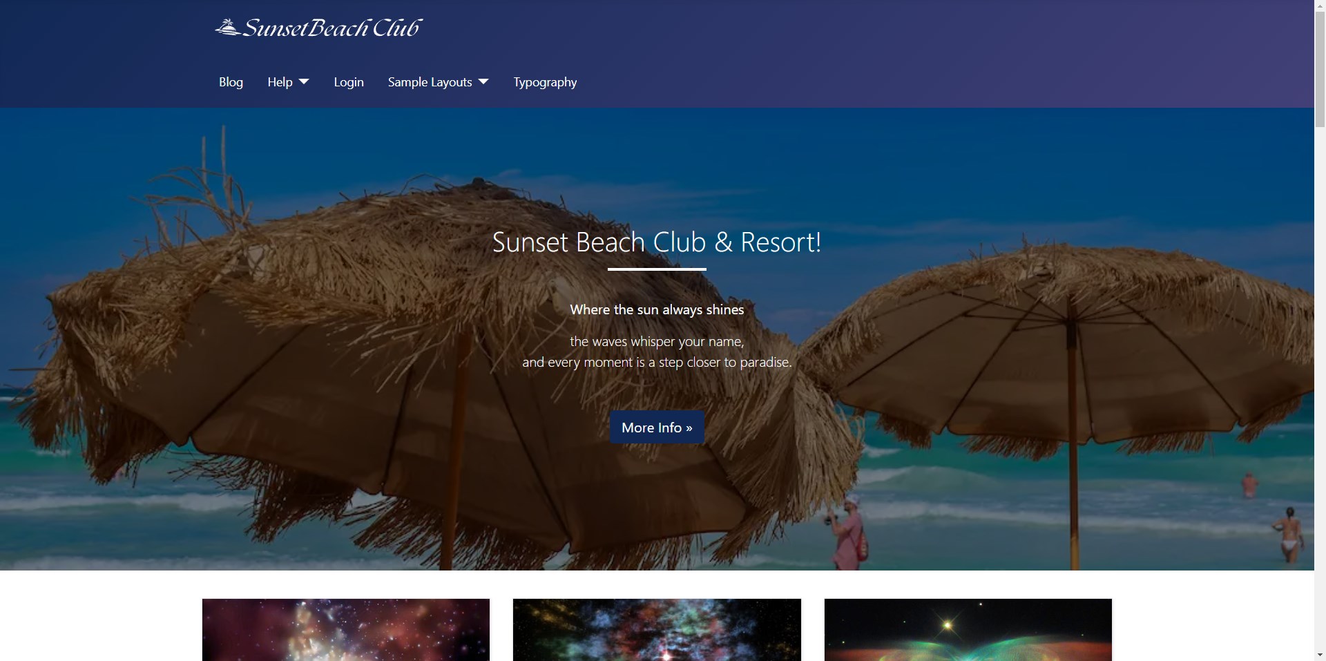
Part 2 - User.css
With the Cassiopeia template you can create a file named user.css in the media/templates/site/cassiopeia/css folder and any CSS in that file will override existing CSS in the main template. This is a very convenient way to modify the template without any risk that your changes will be lost on an update.
.container-header
The solid header at the top of your site has both a background-image and a fallback background-color.
I could try to change background-color to closely match the dominant colour in the photograph and for simplicity I am going to unset the background-image so only the background-colour is used.
.container-header {
    background-color: #004177;
    background-image: unset;
}
Unless you are very lucky then that really doesn't achieve what we want as it still looks like a solid bar instead of the menu and logo sitting on top of the image.
So we need to do a few more CSS tweaks to achieve that. Firstly we need to set the background colour to be transparent.
.container-header {
    background-color: transparent;
    background-image: unset;
}
Now we have removed the background completely we can fix the header to the top of the page above the image.
.container-header {
    background-color: transparent;
    background-image: unset;
    position: fixed;
    top: 0;
    left: 0;
    right: 0;
}
Result of Part 2
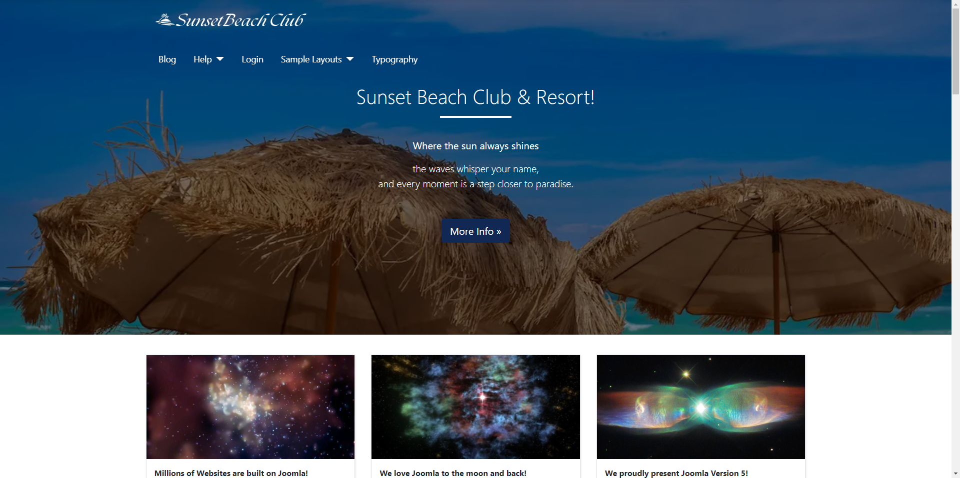
At this point the top of your site will look similar to this.
Part 3 - Moving the logo
It's looking good but it would look much better if the logo was on the same row as the menu.
Go back to the Cassiopeia template style and turn off the option to display a brand logo. That will remove the existing logo and we can then create a new custom module and add the logo there and then publish the module in the menu position. I found that I needed to tweak the padding on this new module so I added the following to my user.css
.mod-custom p {
  margin: 0;
 }
We can change the order from Menu - Logo to Logo - Menu by simply changing the order of these two modules if you want to.
Result of Part 3
At this point the top of your site will look similar to this.
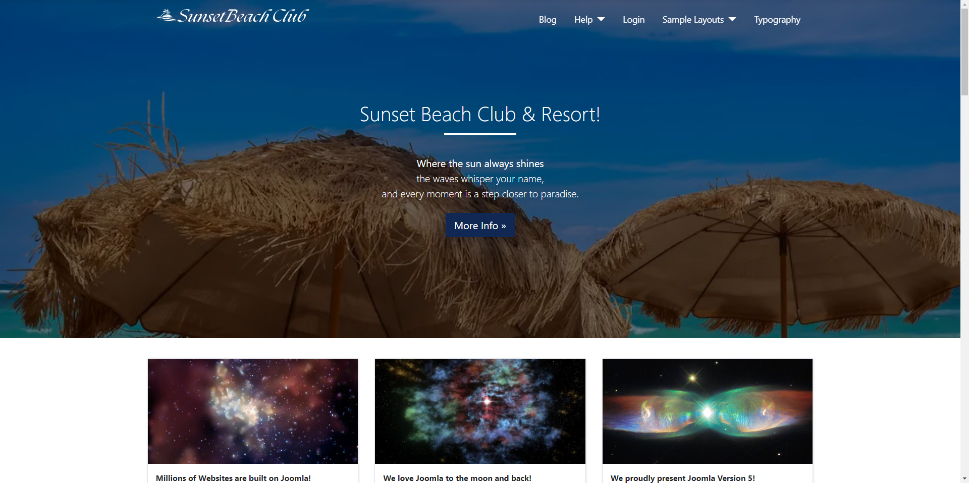
Part 4 - Scrolling
If you are following along then you will have noticed that as you scroll down the page the lack of a background to the menu/logo row makes the menu hard to read so we need to put back the menu background when we scroll. This will require adding another class to our user.css and also to create an equivalent user.js file in the media/templates/cassiopeia/js folder.
The Javascript
We now need to add some javascript that will listen for the page to be scrolled and after 50 pixels adds a new class called scrolled to the container header.
document.addEventListener('DOMContentLoaded', () => {
  const navEl = document.querySelector('.container-header');

  if (navEl) {
    window.addEventListener('scroll', () => {
      if (window.scrollY > 50) {
        navEl.classList.add('scrolled');
      } else {
        navEl.classList.remove('scrolled');
      }
    });
  }
});
The CSS
.container-header.scrolled {
  background-color: #004177;
  background-image: unset;
}
Result of Part 4
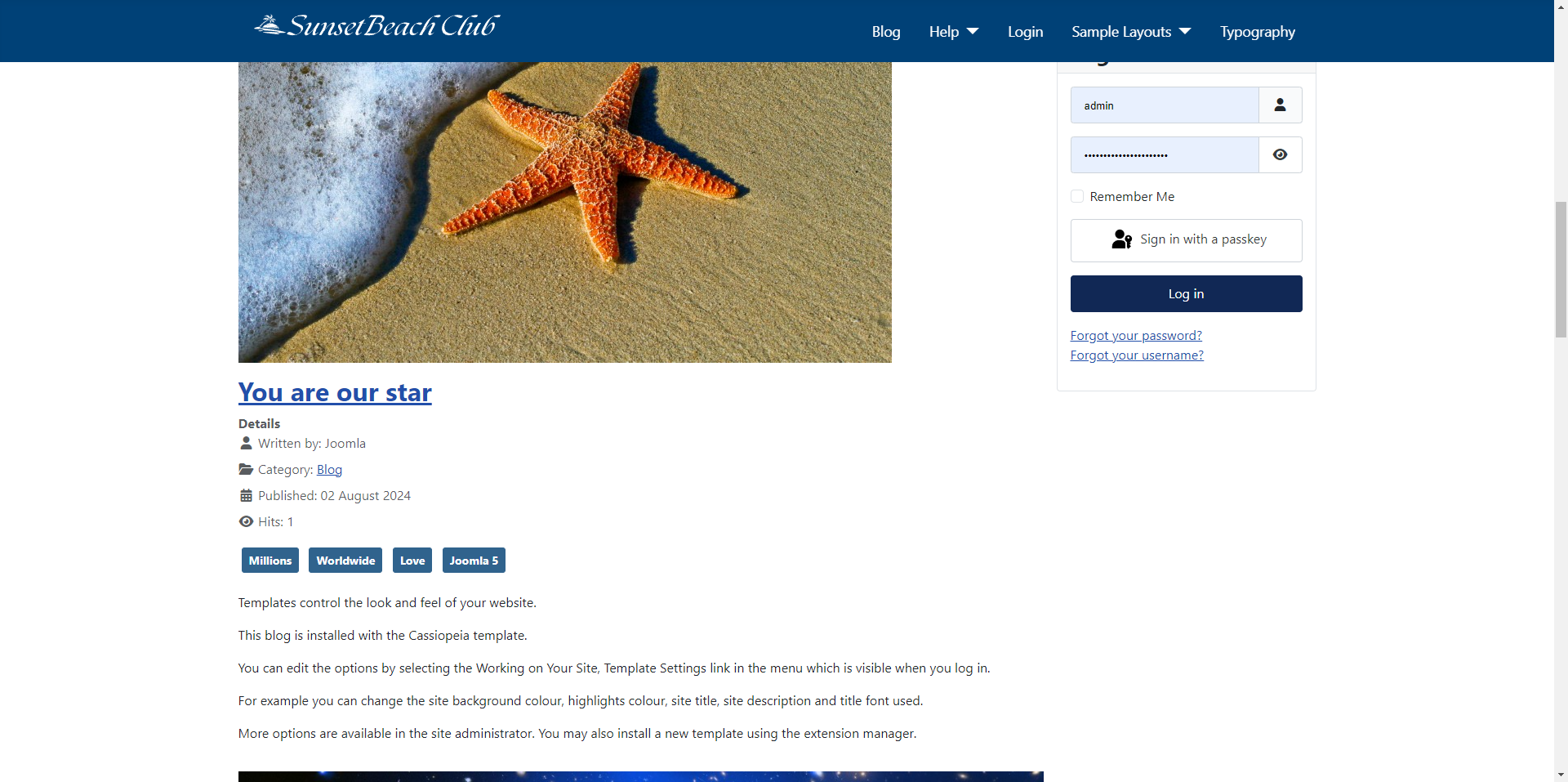
Part 5 - Are we done yet?
If you've been following along then you might think we're done - I know I did at first. The problem is that all of this css will only make sense on pages that have the big image. On my internal pages that don't, the menu and logo are once again impossible to see.
Home Page only
As I said at the beginning we could make some changes to the template php file to detect the homepage but I don't want to change that file at all. Instead I am going to fall back to something I almost never do and that is to set a page class on the menu item. To make it simple I am going to call this class ishome. Joomla will now add this class to the body class of the homepage.
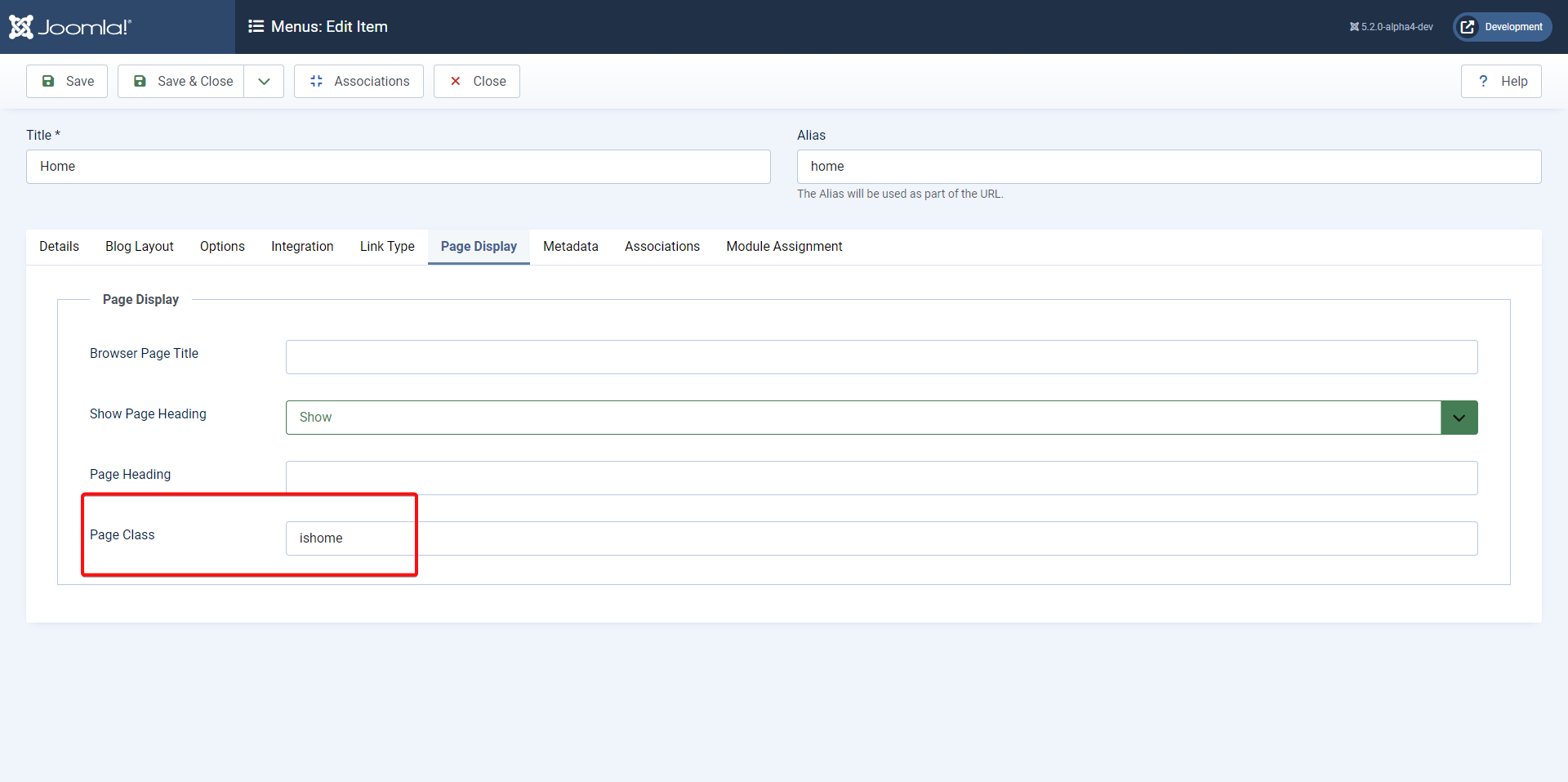
Final Tweaks to the CSS
Now all I have to do is to tweak my CSS so that it only applies to pages that have the body class ishome and to set the vertical height for the image to be full screen.
/* on the home page, set the background colour of the header to transparent and make it fixed */

.ishome .container-header {
  background-color: transparent;
  position: fixed !important;
  top: 0;
  left: 0;
  right: 0;
  transition: all 0.5s;
}

/* set the background colour of the header on regular pages and when the page has scrolled*/
.container-header,
.container-header.scrolled {
  background-color: #004177;
  background-image: unset;
}

/* remove the margin from the module containing the logo */
.mod-custom p {
  margin: 0;
}

/* set the large banner to take up the full height of the viewport */
.container-banner .banner-overlay {
  height: 100vh;
}
Some articles published on the Joomla Community Magazine represent the personal opinion or experience of the Author on the specific topic and might not be aligned to the official position of the Joomla Project
By accepting you will be accessing a service provided by a third-party external to https://magazine.joomla.org/
 Community Magazine

Comments 2
Hi Brian,
Thank you - very easy to follow and understand - a few years back I made the same type of result with a framework and a template, had I known this and Cassiopeia better, I could have made it even easier on myself
Great article as always.
I signed up just to be able to say thank you for this article!
, should also be mentioned before "Result of Part 2". Because without it the the actual result won't match your screenshot. Took me quite a bit of head scratching trying to understand how the banner picture is supposed to flow over the header, and it obviously didn't until I noticed the at the very end.Really like the way you build things up.
One small remark if I may.
The very last paragraph in your writeup,