Rebuilding Our Site Part 1: Wireframes, Design and Our Audience
Every year around spring we do a redesign of our site. This time we went for responsive design and added a few more HTML5 & CSS3 tricks we learned along the way. We also thought more about our content strategy and audience in this build. Checkout Part 1 of our "Rebuilding Our Site" Series!
Who is our Audience?
The first question in any design/build/business plan should be: Who is our audience?
Who do you imagine coming to your site/business and why? What do they want from you?
If you have an existing site/systems, there are a couple ways to look at this:
- Facebook Data for your business/brand gives you direct information about your demographic (even age groups and gender).
- Google Analytics: You can figure out your audience based on how they view your site.
- Desktop vs Mobile (should you go responsive?)
- Time of the Day (EX: people staying at home to browse during the day)
- Location (EX: Why are people in London coming to your site?)
- Search Keywords
- Popular pages on your site (Why does this page get so many hits? What keyword is bringing people in?)
- Twitter: Who follows you/your business?
- Ask your co-workers, friends, family, strangers and yourself who your audience can include.
The last question is the most important one. Who can you include in your audience that you currently don't have. How can you achieve that without alienating your current audience?
Note: If you don't have an existing site/systems in place, you can probably do #4 and some competitor research in order to get underway. Google is your friend, so use it!
Let's Talk About Colors
You should know by now who your demographic is. In our case, we happen to have a strong demographic of males in their early 20s to late 40s. So what did we do? We like the colors we were already using, but decided to define a set for the entire site before starting the build. This way we can keep things consistent.
But how did we choose these colors? Blue happens to be the color of trust. Different colors evoke different emotions and choosing the right one will help you achieve your goals.
| Red - Reds evoke many different emotions. Light reds bring to mind feelings of love and femininity. Bright reds can represent passion, speed, and danger. Dark reds often evoke a matured feeling. | 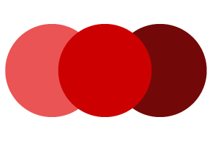 |
| Yellow - Yellow evokes a certain energy. It’s often associated with sunshine. It can also evoke caution, hence all those yellow street signs. | 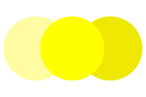 |
| Orange - This is a good mix between red and yellow. It evokes the passion and energy that red and yellow have to offer, but in a way that is more inviting. | 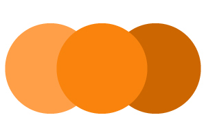 |
| Blue - Blue often evokes feelings of trust and health. This is why the healthcare field predominantly uses blue. Light blues often have a youthful feeling. | 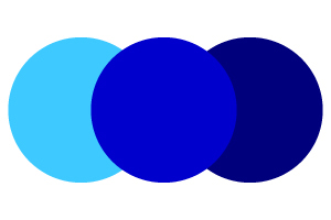 |
| Green - Green is a well balanced color that gives a feeling security. It’s often used to represent nature. Dark greens are often associated with money and therefore give a feeling of wealth. | 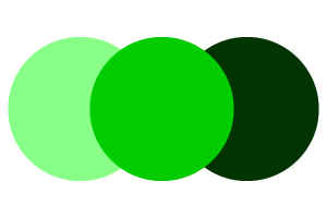 |
| Purple - Purple is calming and is often associated with creativity. Dark purples make things look luxurious while light purples make things look romantic. | 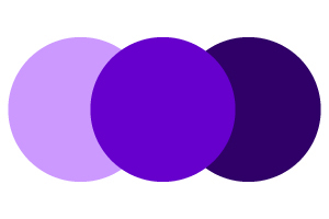 |
We decided that we want to continue to build on our existing clientele instead of expanding to different demographics. We took things we knew were working and applied them to our site while expanding in many different ways.
Draw before you code
Prior to coding, We first created a wireframe using Adobe Illustrator. This way, we can figure out our look before we spend any time turning it into code. Code is a lot more expensive and time consuming. It's smoother to code when you know what the final results are supposed to look like. You also end up with cleaner code. Clean Code = Faster Website.
The Framework
Once we agreed on the look of our site, we started coding our HTML/CSS framework. The framework is made up of recurring pieces which are used throughout the website. A recurring theme in this case is the H elements such as H2s and H3s.
By coding these pieces early on, we can smoothly integrate it into the rest of the code. In fact, we went as far to create our own little Bootstrapped version of a default K2 template. This way, we knew that the CSS class names were following a certain convention. We use dashes instead of camelCase where we could.
Note: We decided to go with Bootstrap as our underlying framework since Joomla 3.5 (the next long term support version of Joomla) will also be using Bootstrap. We do have a LESS based compressor plugin for K2 that we built, but we decided against using it on this version of our site. This might be released later.
Some articles published on the Joomla Community Magazine represent the personal opinion or experience of the Author on the specific topic and might not be aligned to the official position of the Joomla Project
By accepting you will be accessing a service provided by a third-party external to https://magazine.joomla.org/
 Community Magazine

Comments