Accessibility Testing the Colours of Your Website
Web accessibility is important for all websites and applications that we design and build to allow users with visual impairments or visual difficulties to easily view and consume content. Colour contrast happens to be one of the key elements of a design that can be tweaked and implemented correctly to help improve the visibility of text on a page, whether it is in the body of the page, or in the navigational elements of the website. Keep in mind, it isn't just users with visual impairments, but can also be users in situations where the screen that they're viewing is in an environment where it is harder to see such as sun glare on a screen. It also happens to be a very easy success criterion to test for and implement a fix to help meet WCAG 2.0 requirements.
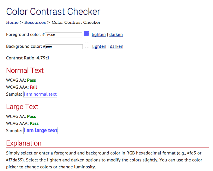
As set out in the WCAG 2.0 1.4.3 success criterion, a contrast ratio of 4.5:1 is required to meet WCAG 2.0 level AA standards.
"Hues are perceived differently by users with color vision deficiencies (both congenital and acquired) resulting in different colors and relative luminance contrasts than for normally sighted users. Because of this, effective contrast and readability are different for this population. However, color deficiencies are so diverse that prescribing effective general use color pairs (for contrast) based on quantitative data is not feasible."
Because of this, we use a formula to better determine the colours required to meet minimum requirements of contrast.
An easy to use online tool that you can use to test the contrast ratio of text on a page is WebAIM's Color Contrast Checker. Simply grab the hex value of the foreground text, and the hex value of the background and enter them into the input fields of the online checker and let it work out the contrast ratio for you. It is as simple as that.

With this information you can improve your designs and final output of your website or application to make it just that little bit more accessible for anyone using the web.
You can take this a step further and meet level AAA standards of colour contrast and increase the contrast ratio between foreground text and its background colour to 7:1.
Give the tool a go and leave a comment on this article on what you have tested and the results that you have found. Perhaps test our very own Joomla.org network of websites and help improve the accessibility of Joomla in general.
Some articles published on the Joomla Community Magazine represent the personal opinion or experience of the Author on the specific topic and might not be aligned to the official position of the Joomla Project
By accepting you will be accessing a service provided by a third-party external to https://magazine.joomla.org/
 Community Magazine

Comments