 Community Magazine
Progressive Enhancement: Flip the Script on Your Responsive Ways
Designers and developers are used to thinking like the average desktop user. But now that the mobile revolution has arrived, design is a multi-part process. How do you start designing for the guy tapping away on his smartphone? And which do you tackle first – mobile or desktop? It turns out that progressive enhancement – creating the mobile website first – can actually lead to a better, more user-friendly website experience later on.
We all know the way web design has been done for a while
Although there were plenty of methods, they all used to basically boil down to one main focus: design for the desktop. Our default for years as web designers has been catering to the desktop user.
Of course, every company has used their own style and design techniques, both sophisticated and simple. Some companies went through a strict process or wireframing and moodboards, and some would just rely on the prowess of their designers to create an eye-popping design in Photoshop or another similar program.
The thing is, this worked. It worked well. It still works if you ignore the new mass media known as mobile.
You can't ignore mobile
Nowadays, businesses are learning that everyone is glued to that pocket powerhouse known as their smartphone. Mobile devices can pull up any website – this is true – and companies kind of leaned on this for a little while as an excuse to not think about the mobile user. Besides, all of that pinching and zooming is fun, right? Maybe at first, but studies have shown that responsive design shows a good increase in conversion and usability.
So, now that we know that we should design responsively, where do we begin?
It's harder to downsize
As a designer and developer myself, I began this process with a recent client by first considering the big picture. My first task was figuring out what all exactly needed to be included on their website and all of its pages. Naturally, having considered the whole gestalt right off the bat, I wanted to begin by designing the full version of my client's site with all of the necessary information. So I created an awesome design for the desktop and then proceeded to scale it down to mobile.
This technique does work – don't get me wrong – but in my opinion, using progressive enhancement is much more effective. We have used it frequently for recent clients who went responsive with Joomla! 3.0.
Let me tell you why progressive/responsive design has become my modus operandi.
Progressive enhancement begins with mobile
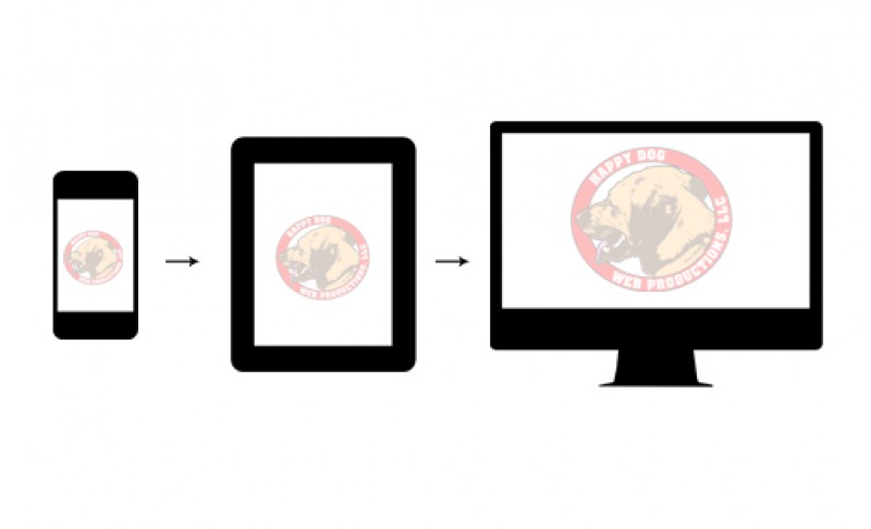
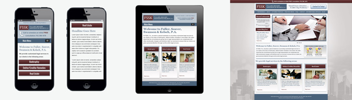
Progressive enhancement is when you design from mobile first, and scale up. The whole uber-important paradigm shift through this process is that you go from "taking things out" to "placing things in." You still have to outline what is necessary for each device, but wireframing for a mobile device is much easier than for a desktop, and it makes scaling up much easier. Here is an example from one of our clients with their progressive enhancement -- starting mobile first.
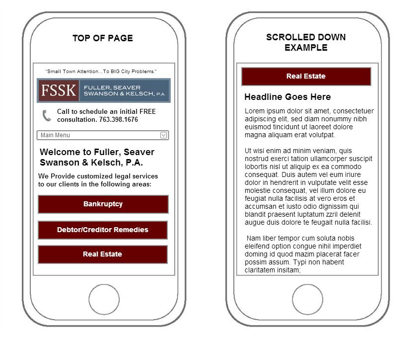
Wireframing this was simple. We were easily able to incorporate what was needed without any extra hoopla. It took very little time, and it was easy to jump to the next step and add in the features we need, instead of subtracting them. Next, we had to think about user on tablets. What do they need to see and not see. It was much easier to expand instead of subtract.
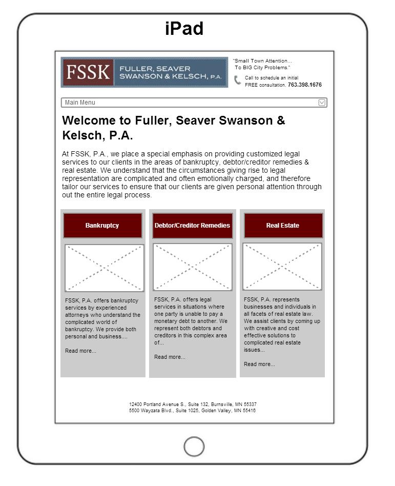
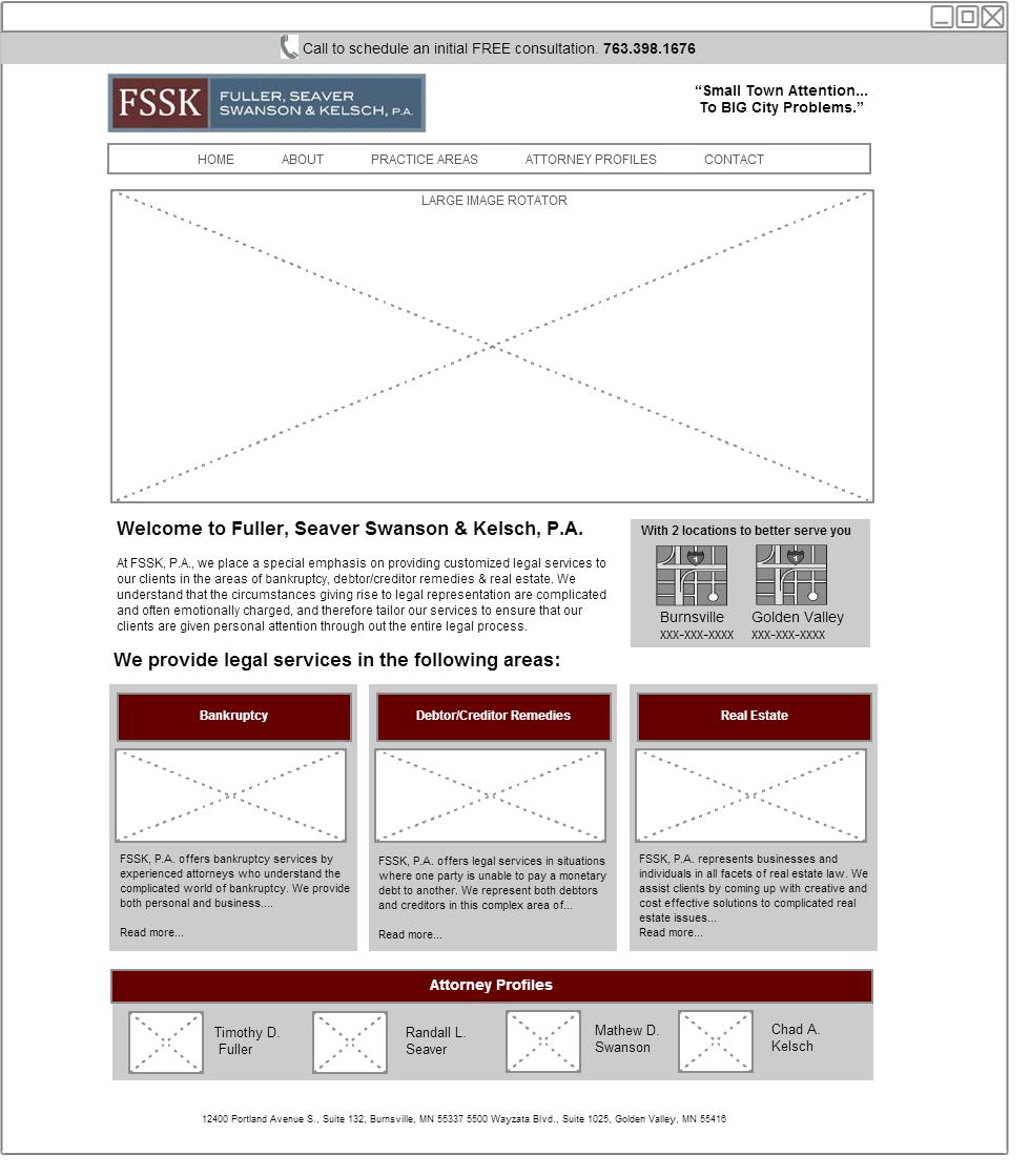
At this point, we were excited to do the desktop version. We had a solid base from which to build and came up with some features that might not have occurred to us before if our process hadn't begun with focusing on mobile design. Beginning with the essentials was key. When we considered the immediate needs of mobile users and developed a site for them first, it was much easier to add on extra elements that would be necessary for a desktop user afterwards. We were able to create this wireframe efficiently and to be honest it was a little fun doing it this way.
Starting small pays off
So now we had the wireframes laid out for all three devices. The little switch on starting with a small device and growing from there made a positive difference in development. Ultimately the client was beyond thrilled and comparing it to our other development projects that didn't use progressive enhancement, it was way more efficient.
Put your touch on it
Now that you have your wireframes and know what design elements you can use, the fun part is making these "boring" wireframes come to life! We are fortunate to have great designers on hand, but now that you have set this progressive foundation, designing has become exponentially easier. Our designer, Mike, stated
I can't believe how much simpler this makes the design process. It's like when you peg in all of your needs, you can flesh out what the client needs a lot easier.
In the end, we were able to provide a design that the client saw the whole way through and was perfect for their situation.
Wrapping it up -- Be a champ
We've done a few different methods when it comes to design and development, but switching our responsive brain to start with mobile and progressively enhance our way to the desktop was a wise choice that helped us, and hopefully can help you too. Making that switch from starting from the desktop might be one of the better decisions you make this year.
- sidenote: You can view the live website at www.fssklaw.com. You'll notice slight deviations from the design, and somethings just show differently when on a live site. Scale your browser to see the responsive goodiness. This is on Joomla! 3.0 using core bootstrap for the majority of the responsiveness
Thanks guys. Hope my first article was informative. Get out there and develop responsively like a champ. Go progressive!
Some articles published on the Joomla Community Magazine represent the personal opinion or experience of the Author on the specific topic and might not be aligned to the official position of the Joomla Project
About the author
By accepting you will be accessing a service provided by a third-party external to https://magazine.joomla.org/
Comments