Cassiopeia, Joomla’s powerful built-in template: how to use css classes to style images
In the last article of this series (Cassiopeia, Joomla’s powerful built-in template: how to use css classes for your category blog) we talked about css classes for the category blog. Now we want to explore the possibilities for styling and positioning images inside an article.
Articles Options
From Joomla 4 it has been possible to insert css classes for the images. Under Content -> Options -> Editing Layout you can find the fields Intro Image Class and Full Text Image Class. The classes you enter here are used globally for all articles. The field Intro Image Class is only relevant for a category blog and is not part of this article. We will have a deeper look into the Full Text Image Class field. On a standard Joomla installation the field is filled with the class “left”. Legacy classes "left" and "right" only float an image in the corresponding direction in Cassiopeia.
Using classes
Since Cassiopeia is based on Bootstrap, we can use the classes "float-start" for positioning the full image on the left (on the right for rtl languages) of a text block, "float-end" for positioning the full image on the right (on the left for rtl languages) and "float-none" for no floating (https://getbootstrap.com/docs/5.3/utilities/float/).
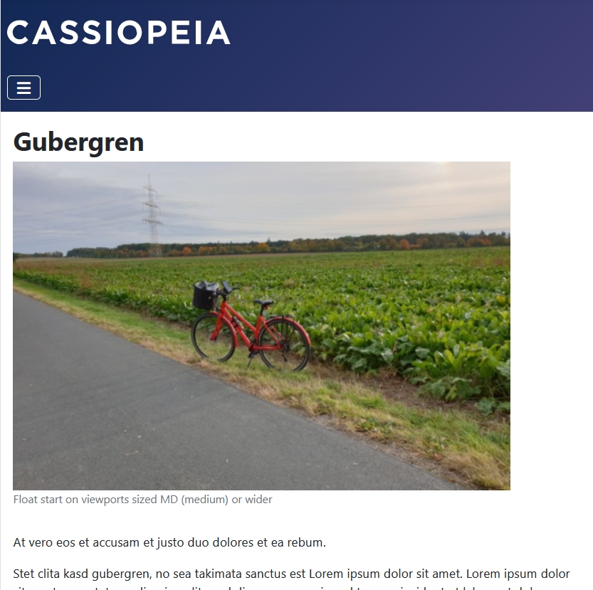
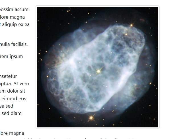
To test the classes we will create an article and add a full article image to it in the tab "Images and Links":

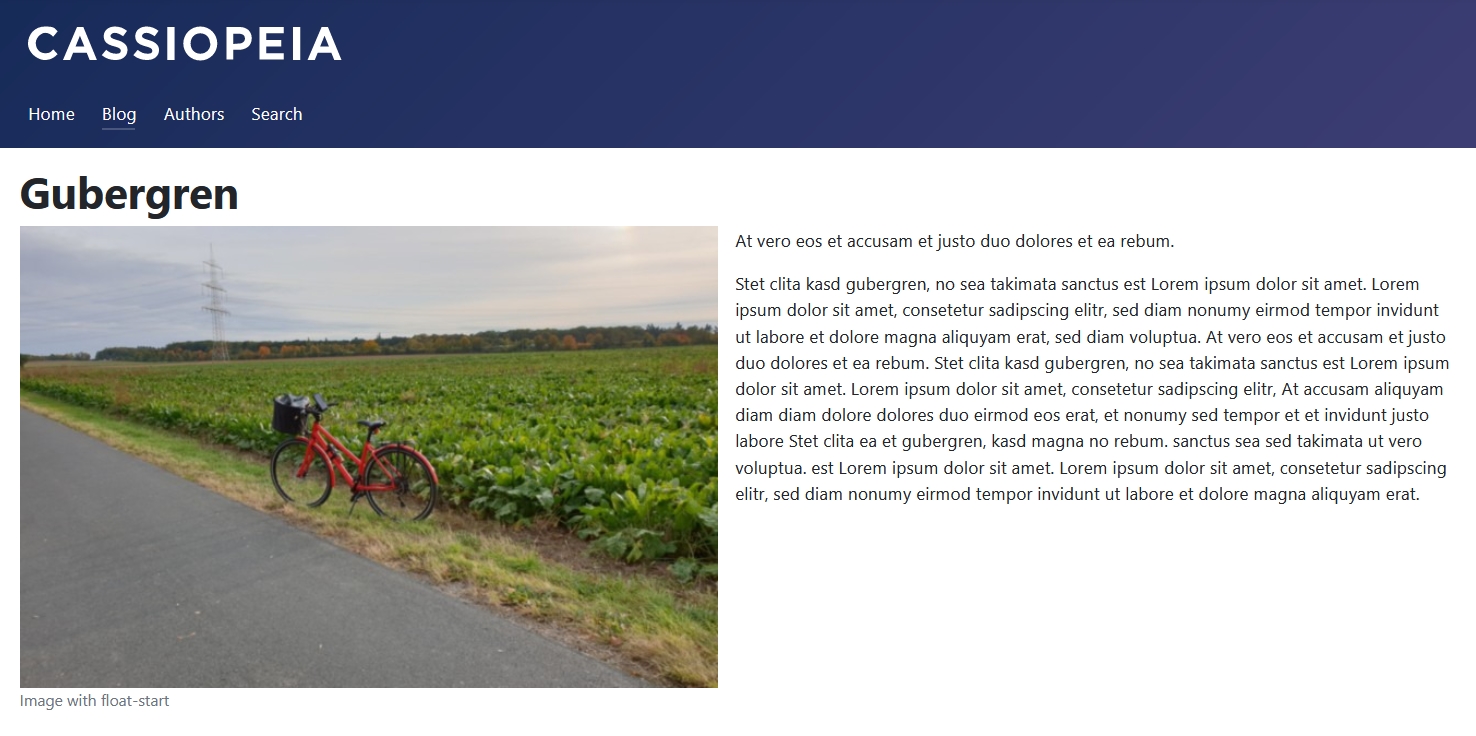
Here we are using the global class "float-start" which we entered under Content -> Options -> Editing Layout -> Full Text Image Class, but you can enter a class on each individual article. Here is the result on the frontend:
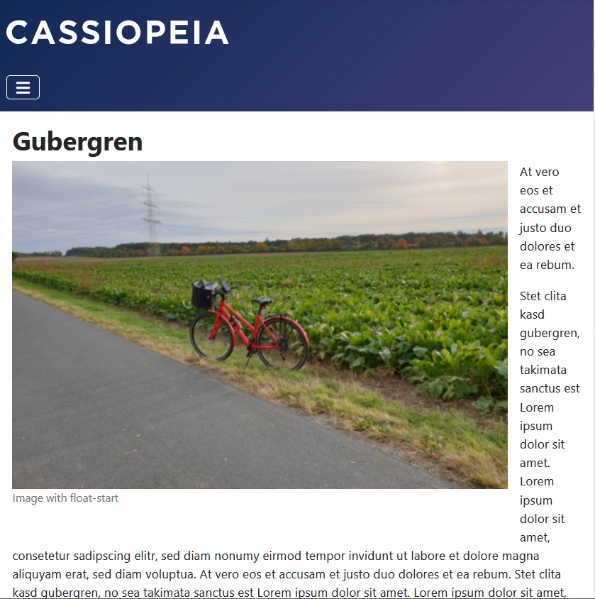
For a good looking floated image, the dimensions of the image are very important, because you need space for the text too. If the image is too big, there will be no space left for the text. If we use "float-start" or "float-end" the image will float (or try to) no matter the width of your viewport, with unattractive results. That is how the floated image looks on a 767px wide viewport:
To overcome this problem we can use responsive float classes: https://getbootstrap.com/docs/5.3/utilities/float/#responsive
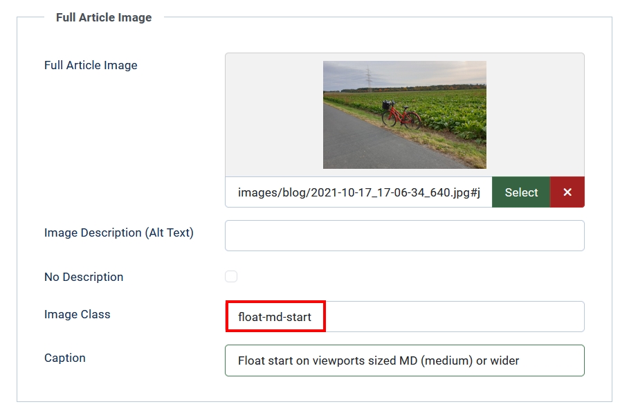
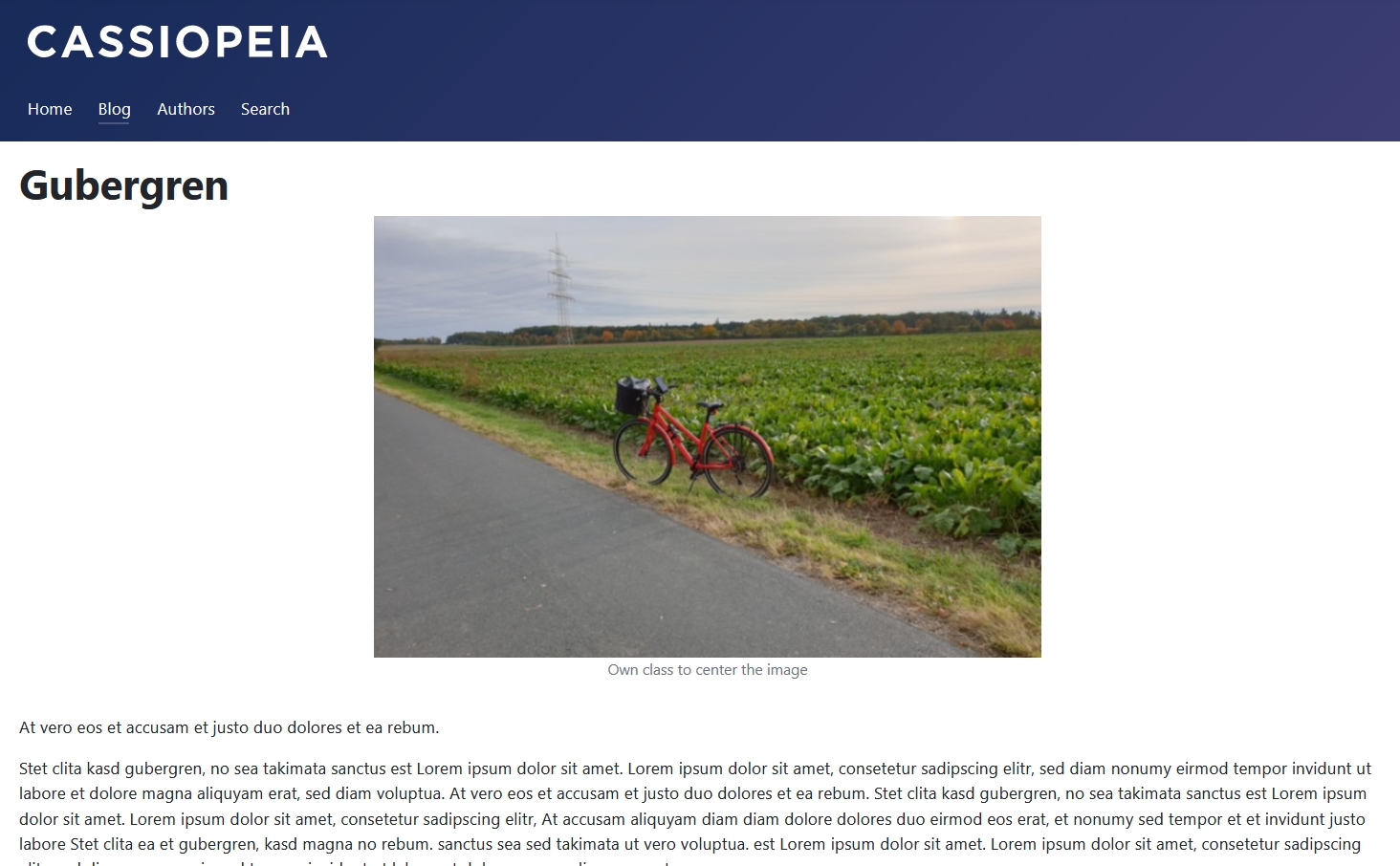
Using "float-md-start" the image will float only in viewports bigger than 767px. In smaller ones the text will display under the image:
The only problem with the responsive float classes is that they don’t include a margin to the text, but you can add a class for the margin too, e.g. "me-md-2": margin end (on the right side of the image, for viewports medium and bigger and the size 2, that is .5rem). More on spacing in Bootstrap: https://getbootstrap.com/docs/5.3/utilities/spacing/
Of course, it is also possible to modify the position of the image using your own css class. Do you want to center the image? Enter “image-center” as class in the field and add the following css definition on your user.css file:
.image-center {
  text-align: center;
}
You can read more about the user.css file in a previous article of this series: https://magazine.joomla.org/all-issues/december-2023/cassiopeia-joomla-powerful-built-in-template-the-basics
Styling images inside an article
Sometimes we will have more than one image in an article. We can use the field full text image for the first image and insert more images in between the text. Also here you can use css classes.
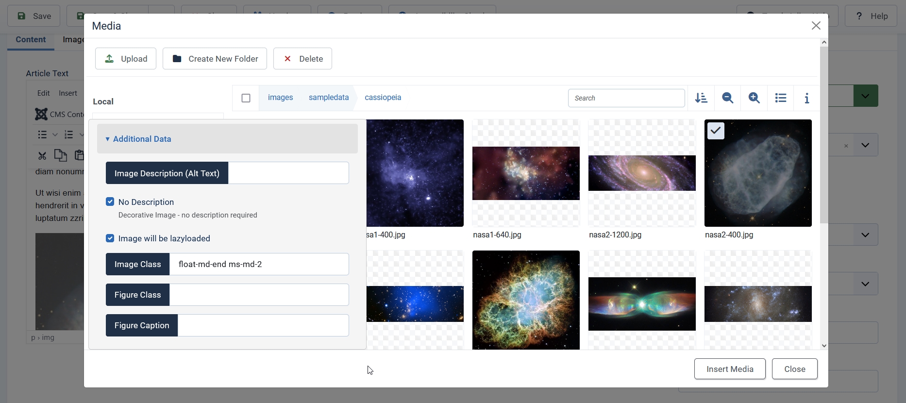
To insert an image in the text open the dropdown CMS Content and select Media, navigate to the right folder and select an image. A new window will open with several fields:
- Image Description (Alt Text) - important for accessibility and SEO. In case your image is merely decorative you can check the box “No Description”, Joomla will add an empty alt-attribute (alt = “”) to the image
- Image will be lazyloaded
- Image Class: the css class will be added to the image element itself
- Figure Class: the css class will be added to the figure element containing the image. A figure element will only be created if there is a caption
- Figure Caption: a visible caption for the image (the caption is an enhancement and not a replacement of the image description)
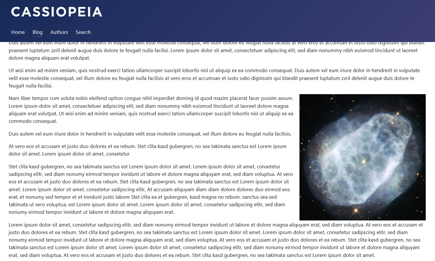
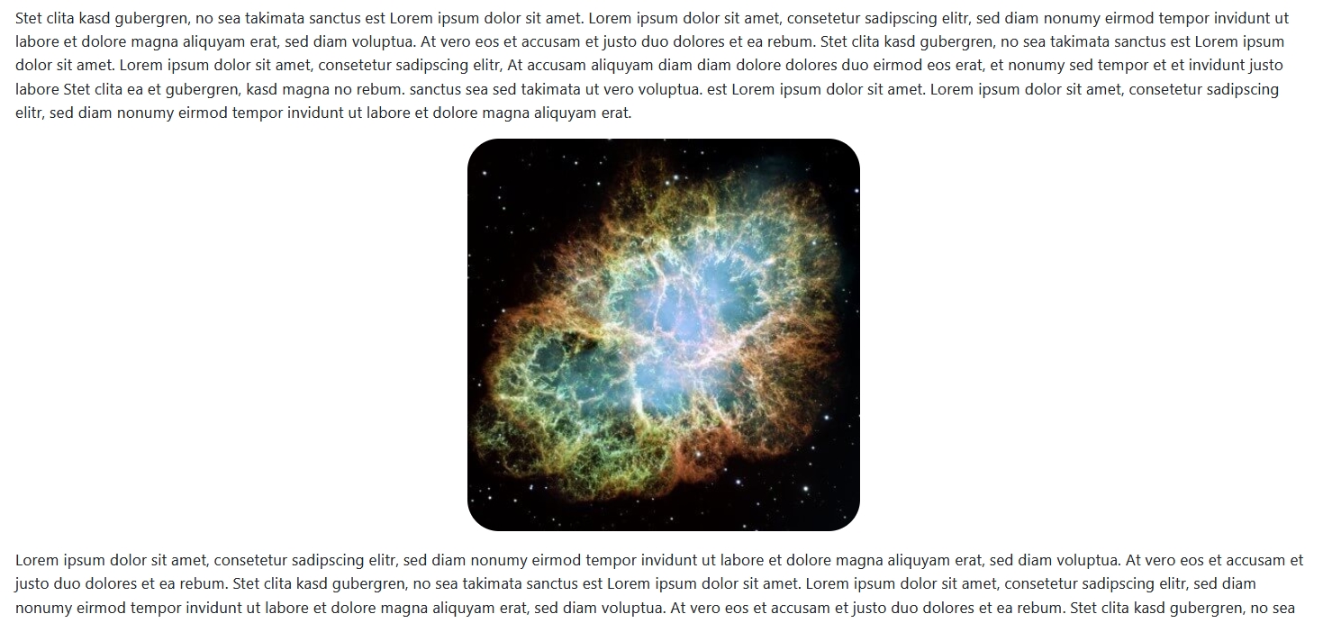
The image was inserted on a text block and it is displayed on the left side of of the article ("float-md-end"):
Fancy examples
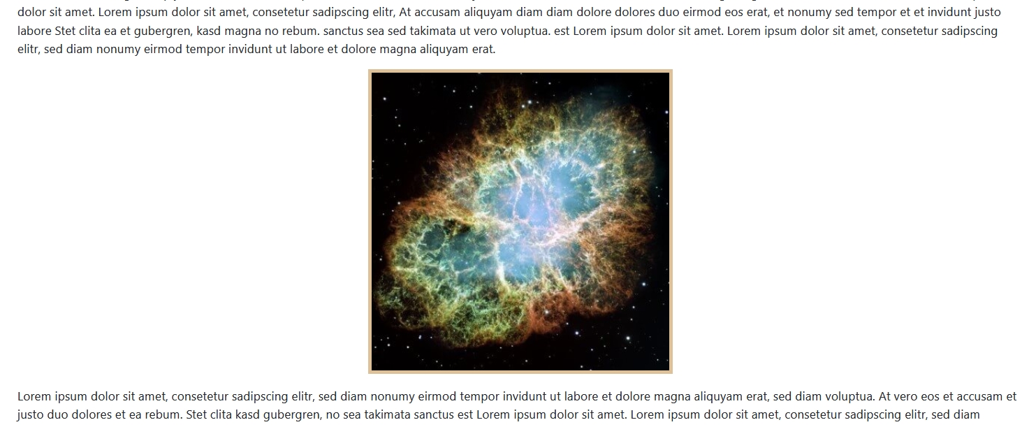
Let’s try other styling possibilities. Bootstrap has the class “img-thumbnail” for images:
The class adds a faint border around the image.
Or what about a centered image with rounded corners? Easy! Just add the classes “rounded-5 mx-auto d-block”:
More about rounded corners: https://getbootstrap.com/docs/5.3/utilities/borders/#radius
In the next example we will add a yellow border to a centered image: “border border-5 border-warning-subtle mx-auto d-block”:
More about borders: https://getbootstrap.com/docs/5.3/utilities/borders/#border
As you can see using Bootstrap classes you don’t need to write a line of css on your own.
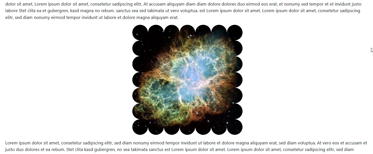
Do you want something more fancy? I found this border generator: https://css-generators.com/custom-borders/ and used the following code for my image:
.box {
    --mask:
        linear-gradient(#000 0 0) 50%/calc(100% - 55.5px) calc(100% - 55.5px) no-repeat,
        radial-gradient(farthest-side,#000 98%,#0000) 0 0/60px 60px round;
    -webkit-mask: var(--mask);
            mask: var(--mask);
}
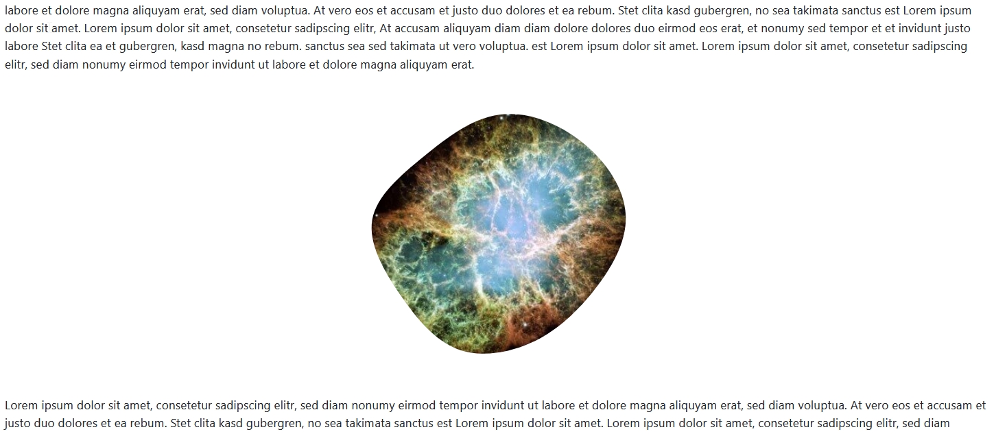
A last example of styling images with the property mask-image. Using a SVG generator I have created a blob form (https://app.haikei.app/) and stored it under "media/templates/site/cassiopeia/images". With the following css code I use the SVG as a mask for my image:
.fancy-border2 {
    -webkit-mask-image: url(../images/blob-haikei.svg);
    mask-image: url(../images/blob-haikei.svg);
    -webkit-mask-repeat: no-repeat;
    mask-repeat: no-repeat;
}
More about the property mask-image: https://www.w3schools.com/css//css3_masking.asp
With css you have a lot of possibilities for styling your images in Joomla. Check the Bootstrap documentation, make yourself familiar with the css classes available and use them! If you find something inspiring on the web, check the code, create a css class in your user.css file and make your images fancy!
About the author
By accepting you will be accessing a service provided by a third-party external to https://magazine.joomla.org/
Comments